
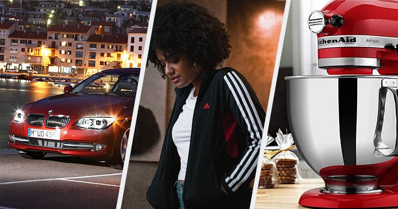
Details added in by product designers that define the brand.
Have you ever seen a product from afar and just knew: “Oh yeah, that is a Brand-X product.” Yet, there are some brands whose products look like they could be from entirely different companies.
As an industrial designer, I appreciate the details I see other designers place into products to signal the brand. Today, I am going to share some examples of those branded design elements.
A logo is not the only way to denote what company a product comes from. It is far from the best way because a logo can be covered up, and some products cannot have a logo (like food products.)
Products can be branded through color and visual language as well.
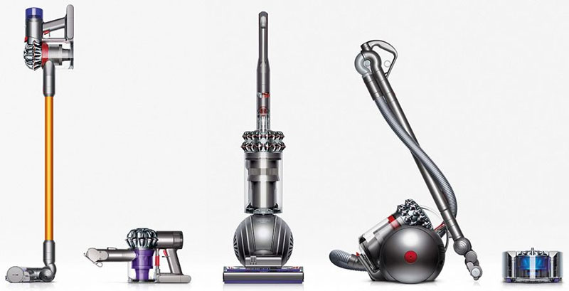
For example, Dyson vacuum cleaners are recognizable because of their silver finish and repeating shapes in the product design across their whole line.
These are design details (like the Dyson cyclone tubes) that are so tightly associated with the brand that you know it’s a Dyson when you see it. Moreover, any other brand would look like a half-rate copy if they used the same design element in their product.
A brand’s ability to be recognized and defended are substantial strategic advantages. Designers hope that these design details will be carried through for generations as they have for the Kitchenaid stand mixer and BMW double grills. (More about both Kitchenaid and BMW later.)
We expect to see these details in consumer electronics and cars, but branded design details are put in products across all industries. Fashion, entertainment, and games also have their brands embedded in their products.
Having branded design details is vital for Veblen goods, products that people purchase at high prices, and use to show off their status. Whether a Lambourhini’s wedge shape or a Gucci bag’s braided gold chain, luxury products need elements that show off the brand without a large logo, which would be considered gauche.
Hopefully, these examples will help you appreciate branded design elements and add them to the products you work on.
Examples of Branded Design Features
BMW’s Double Kidney Grills
You do not need to look at the logo to see that the car approaching you is a BMW. The two grills in between the headlights are so distinctively BMW that there could be no doubt.
“The [1933] BMW 303 represents a milestone in BMW history,” BMW says on their website. “[… I]t was the first vehicle to bear what has become a hallmark that still characterizes BMW nearly 90 years later – the air intake in the form of a pair of kidneys, that would become known as the kidney grille.”
Luxury cars have an extra reason to have design elements that signal the brand to people looking at the vehicle. Some people buy luxury cars to be seen as a person who can afford a luxury car. There are many reasons to buy a BMW, and one is undoubtedly to display a status symbol.
So it is crucial BMW maintain their signature double kidney grills, or potential buyers will question why they want to buy a BMW if it doesn’t look like a BMW. That applies to the grills and the cars and SUVs as a whole.
That is why brands like BMW, Mercedes, and Porsche have a strong visual language that runs through their product lines than the economy brands. You see almost no consistency through the Kia car line, whereas only a trained eye would tell the difference between a BMW 3-Series and a 5-Series on design alone.
Apple’s White Headphones
When you see someone with white headphones in, you know they are listening to an Apple product. Whether it be the wired earbuds or the AirPods, people love being seen with their white headphones because they get to say: “I am part of the Apple club.”
Who would have thought the crummy headphones bundled with an iPod would be such an enduring and recognizable part of the Apple brand. But the distinctively colored headphones (at the time) were the only way to show that you were listening to an iPod because the actual product was in your pocket most of the time.
It was a double-edged sword, though, as criminals were targetting people with white headphones for muggings because they knew they had an iPod or iPhone in their pocket, both of which had high resale value. Apple had to combat this by reducing the resale value of stolen products with password protection, fingerprint unlocks, and the ability to brick the device through iCloud’s “Find My iPhone” service.
Assassin’s Creed Hood
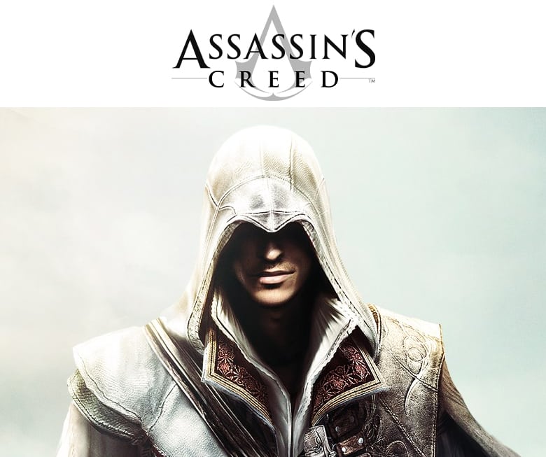
Video games are challenging to brand, especially when streaming and social media are such significant parts of these games’ promotion. Ideally, someone should tell what game you are playing through recognizable characters (like Mario, or Streetfighter’s Ryu) or the game’s general look (like the distinctive look of Fall Guys.)
This consistency of look is even more challenging for the Assassin’s Creed franchise. The series’s core premise is that the player embodies an assassin from a different period and place in time. How do you maintain consistency when the people, location, and historical period of the game are entirely different?
Ubisoft’s answer was to give the main characters a distinctive hood. The shadowy hood interior makes a shape that tells Assassin’s Creed fans exactly what franchise this character is from.
There are other design elements and color schemes in the main characters (Assassins) and the antagonists (Templars) that signal that the game is an Assassin’s Creed game. Still, the hood is by far the most distinguishable one.
Ubisoft has even used the hood in Assassin’s Creed apparel. (I may or may not own an Assassin’s Creed sweater.)
Porsche Four LED Daytime Running Lights
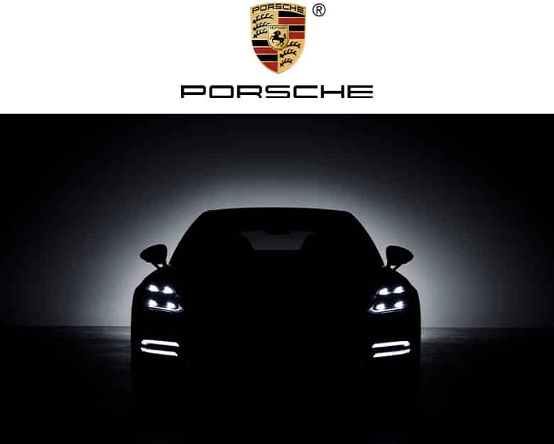
I noticed that almost every Porsche model had four lights in a square pattern that were always on when the car was on. Then I noticed that the taillights also had the design of four lights each, only in red for obvious reasons.
I don’t imagine the German automaker does anything by chance. Part of the Porsche brand is that every aspect of the car is the way it is for a reason: to make the car function or feel better in some way.
One of the functions (arguably THE function) for a large number of Porsche buyers, is to signal that this person is driving a Porsche and has the taste and status that come with that. Porsche cars and SUVs are Veblen Goods; they signal wealth and status.
Sure, some people buy Porsche’s for the driving dynamics and presence that are undeniably great in their vehicles. But others buy them to signal their wealth in the company parking lot or private school drop off loop.
The four LED headlights and taillights are a simple, unique element that signal to everyone looking at the car that this vehicle is a Porsche, for whatever that means to someone.
Adidas Triple Stripe
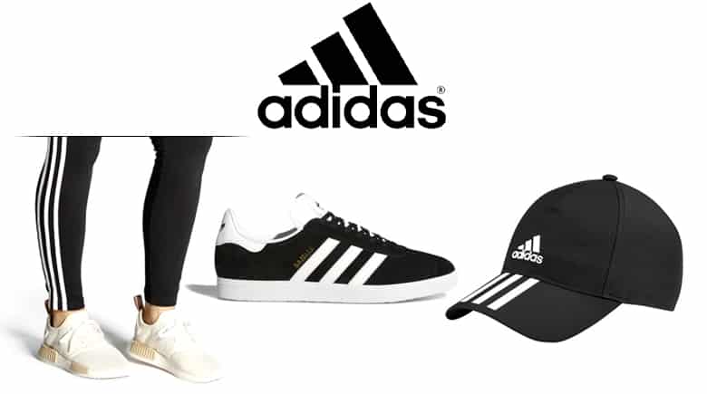
Adidas was one of the brands we covered in our examples of Umbrella Brands. They have a portfolio that spans across more than 14 product categories.
- Shoes
- Sandals / Slides
- Pants / Leggings
- Shorts
- Skirts
- Sports Bras
- T-Shirts / Tank Tops
- Hoodies / Jackets
- Bags / Backpacks
- Hats
- Socks
- Balls
- Guards / Padding
- Phone Cases
- Sunglasses
- And Many More
In almost every product category they compete in, Adidas has one black and white option with the three stripes. The three stripes are echoed in the Adidas logo.
The Adidas brand is so strong that they can take a product, make it in black, and toss on three stripes and an Adidas logo and sell it on the higher end of the price range for that product category.
Good work if you can get it!
(Although it has to get boring for the designers at some point…)
Coke Bottle Sillouhette
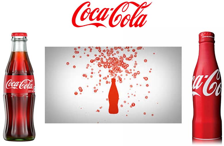
Coca-Cola has to have sold 1000 cans or more for every bottle they have ever sold, but the Coke bottle is an enduring symbol of the Coke brand. There is something about the shape, designed by the legendary industrial designer Raymond Loewy, that has captured the imaginations of the people who see it.
Coke also won’t let us forget about it. They use the shape in the graphics for their packaging and promotion over and over. It has become an icon that we can see and know it is Coke just as much as their logo has been.
Is there a shape that is associated with your brand that you can leverage similarly?
Pokeball Red And White
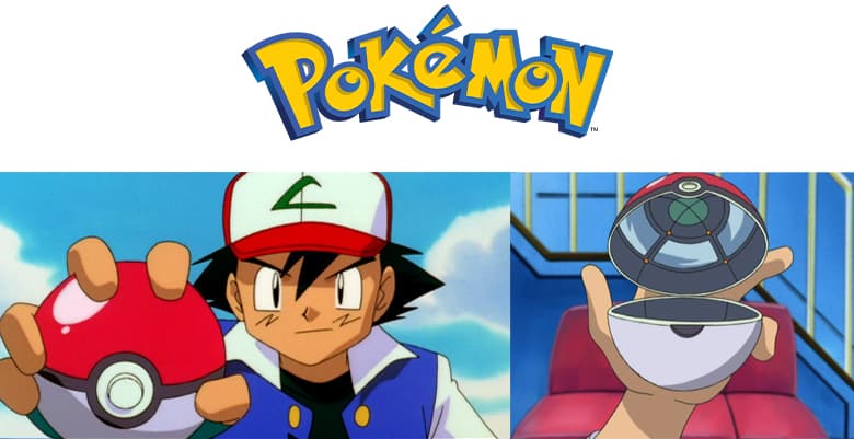
I was interested in Pokemon as a kid when it came out in 1996, and now I am watching the episodes and playing the games with my son here 24 years later.
Pokemon is amazingly enduring; there are even more games, shows, and movies coming out now than at the height of the craze when I was a kid. It has to be the best-managed entertainment brand… ever.
A few things have remained consistent over the years and signal to us that this is a Pokemon game or animation: the distinctive Pokemon logo, Pikachu, Ash Ketchum, and the Pokeball.
For the one or two of you readers who don’t know about Pokemon, the Pokeball is the red and white ball that a Pokemon trainer throws at a Pokemon (the animal) to catch it. After impact, the ball opens up, and the Pokemon shrinks into it in a swirl of energy. There are different types of Pokeballs, but that red and white one is the one everyone starts with no matter what game you are playing or animation you are watching. The Pokemon themselves may change, but that ball is amazingly consistent.
Show us that distinctive Pokeball design, and we know it’s Pokemon.
Disney Castle
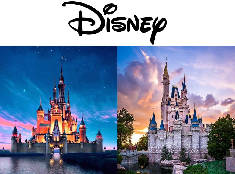
It would be hard to estimate how many times in how many ways we see the Disney castle as kids, adults, and parents. It is part of the Disney logo, animated at the beginning of every movie, in every trailer, and at every Disney theme park. Disney markets only need to flash that castle for the briefest moments, and we know what we are looking at.
And what does it have to do with anything Disney does?
The Disney Castle was originally the castle in Cinderella, a movie that came out in 1950… that was 70 years ago! Until the live-action remake of Cinderella was released in 2015, it had nothing to do with Disney products.
But you could say it has everything to do with the magic Disney is selling, which we identified as core to the Disney brand in our article on Brand Essence. That castle is a signal from the Disney company to you that instantly inspires all of the positive feelings and memories you have from Disney movies, shows, and parks.
Burberry Tartan
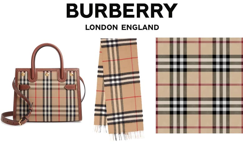
A quick story. My friend was helping me sort out my closet because she had a more fashionable eye than me. She pulled out a brown, red, and gold tartan tie that I had inherited from my father.
“Hey, this is a Burberry tie,” she said. “This is really nice. You could wear this to a wedding and stuff.”
I had no idea what it was. But it turned out to be a tie my father had purchased at the Burberry store in London, England.
Even though the Burberry pattern is not meaningful to me, it does mean something to many people. It is Burberry’s trademark and has come to represent high fashion, British society, ladies, and gentlemen. The Scottish Register of Tartans even lists the pattern as “Burberry (Genuine.)”
The pattern is the trademark of Burberry in most places in the world. If you see this pattern, you can rest assured it is Burberry. The design is as much a call to the brand as the name or the logo.
If every bag manufacturer or fashion designer could use the pattern, it would cease to lose it’sits value because seeing it wouldn’t signal that the product was Burberry or a high-end garment. This has happened in China, and Burberry lost a lot of brand equity when the Trademark Office of the State Administration for Industry & Commerce of the People’s Republic wouldn’t recognize it.
The sudden loss of value Burberry experienced is why brands need to maintain their trademark rights on things that become associated with their brands.
We have a list of TMs in logos. The TM symbol is one way marketers and lawyers try to assert their trademark rights.
KitchenAid Curved Top
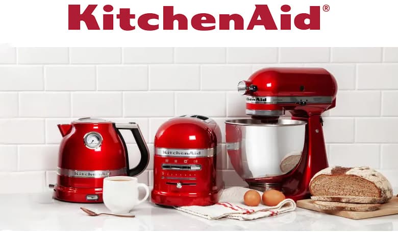
The KitchenAid stand mixer is part of the legend of the starting of the brand. The stand mixer was invented by Herbert Johnson, an engineer who watched a baker struggle to work his bread dough with a large iron spoon. Mr. Johnson engineered a large, heavy, tough mixer called the Hobart.
The Hobart Manufacturing Company made a home model small and light enough to sit on a kitchen counter. When they discussed what it should be called, a salesperson said: “I don’t care what you call it, it’s the best kitchen aid I’ve ever had.” They registered the trademark to “KitchenAid” not long after that conversation in 1919.
The iconic KitchenAid stand mixer we all know was designed 20 years later (1939) by Egmont Arens. The design has mainly stayed the same since. The curves show off shiny, punchy colors, unlike any other form.
KitchenAid has since taken the streamlining and curves Arens added to the mixer and has integrated it into every product where it makes sense, from kettles to blenders.
The visual language Egmont Arens introduced in his mixer design is as much a part of the KitchenAid brand as their name or logo.
Valentino Rockstuds
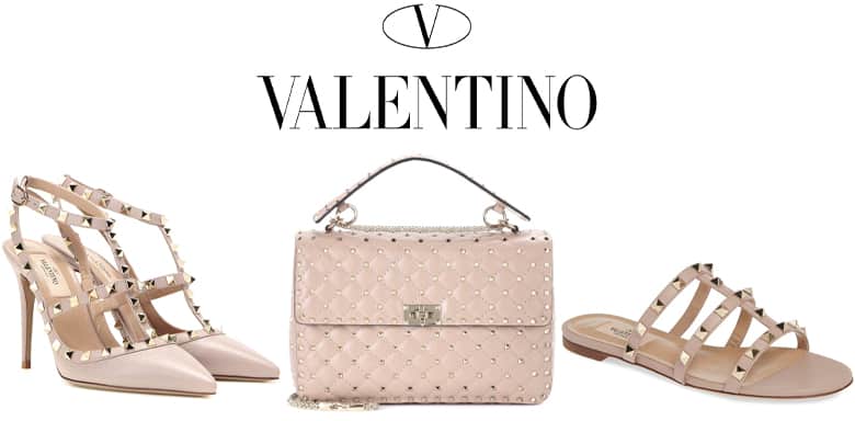
Valentino Clemente Garavani is a beloved designer of women’s wear. The Valentino brand is one which women turn to so they can get a taste of high fashion at an accessible yet high-end price point. A Valentino bag or a pair of heels would be something a professional woman would save up for.
“Valentino as a brand enjoys its reputation as one that combines luxury and elegance with latest trends,” says Swati Talwar on The Luxury Closet’s blog. “The statement style of this label combines punk and Boho style elements to create romantic, feminine statement products with an edgy quality.”
Rockstud Valentino denotes a line of fashion accessories. You would be hard-pressed to find a red-carpet event without a star sporting a Valentino accessory.
Accessories like bags, heals, and flats present a challenge: how does a brand announce itself on such a small product without looking gauche?
Valentino’s solution to this problem at the studs that adorn the accessories. The Rockstuds are plated pyramid studs that run across straps and over flat areas in an offset pattern. The studs are easy for fashion-conscious people to notice even from afar, thus identifying the brand.
Halo Spartan Helmet
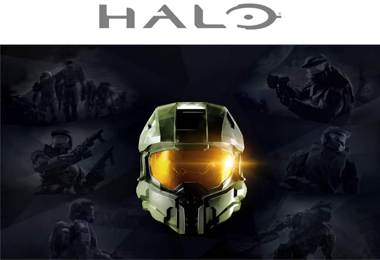
Video games present an interesting opportunity that films do not. Film franchises have stars that are the face of the brand, but they cannot monopolize the actor or actress; eventually, they will be the face of another movie.
But video game developers design their stars. The main characters become an emblem of the game itself, like Commander Shepherd for Mass Effect and Laura Croft for Tomb Raider.
Perhaps the most iconic character is Master Chief in the Halo franchise, which is developed by Bungie. Master Chief is a Spartan, a future super-soldier with the best technology, genetics, and conditioning. His helmet has become an icon of the franchise.
Bungie concept designer Shi Kai Wang came up with the original Master Chief designs. Marcus Lehto of Bungie has confirmed that Master Chief’s original design was inspired by anime, most likely the Gundam series where the massive mechs sport similar brimmed helmets with shiny visors and covered mouths.
Master Chief, then known as “The Super Soldier,” debuted at the 1999 Macworld Expo with a much slender, less armored look. But as the writing and development progressed on Halo: Combat Evolved (the original), it was clear the character needed to be beefier for the players to believe he could take on a horde of aliens or an entire army.
“As we started writing the character… the actual story for Halo… and as we started writing who the Master Chief is… this empty vessel that the character would really take the reins with… [we realized] that the slender character wasn’t the right kind of feel for the Master Chief, and that he needed to look like a tank that could take on an entire army.”
Now Bungie is doing it again. Their new franchise, Destiny, has a very identifiable, brandable style of armor.
Photo in feature image by Jonathan Faria from Pexels
Leave a Reply