Understanding the trends forcing companies to rebrand will help you develop better logos.
Logos are a part of our culture, and culture is always in flux. Aesthetic preferences change, things don’t mean what they used to, and perceptions of logos may not be what they once were. Many companies spend millions of dollars to rebrand to ensure they aren’t left behind.
I have designed many logos and plan to create many more in 2020. Brand designers like myself need to understand what the logo design trends are. Logo trends allow us to understand what clients are looking for, and understand public perceptions towards certain design features.
But that does not mean that we have to follow the trends every time. With any given design, a savvy designer may have excellent reasons to buck the trend. For example, one color logos are all the rage, so maybe a multi-color logo may help a brand stand out from their competitors.
I looked are all of the notable rebrandings of the last year to see what the trends are emerging in logo design. We should take notice if companies are spending tens to hundreds of millions of dollars moving away from a design with specific features and towards a new design they believe will be perceived better.
I looked are all of the notable rebrandings of the last year to see what the trends are in logo design. We should take notice if companies are spending tens to hundreds of millions of dollars moving away from a design with specific features and towards a new design they believe will be perceived better.
13 Logo Design Trends for 2020
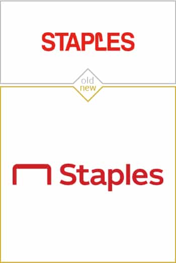
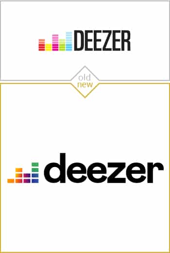
No All Caps Wordmarks
No yelling! Brands are opting for lowercase or title case.
All-caps was the standard in the logo design a decade ago, but the trend has completely turned, and now the lowercase is the preferred case for logos.
It’s no wonder; all-caps is read as shouting to most people in our new social media world. Shouting at customers is generally a loosing strategy.
Distinctive Characters
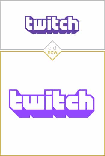
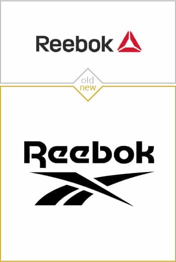
Pro graphic designers are modifying letters in wordmarks to make them more distinctive.
An amateur designer will write out the name of the brand, choose from a hundred fonts, and say “job done.” But a professional brand designer knows that the characters as they come from the font are just the starting place for the wordmark.
Pro brand designers will take great letter designs and modify them to work better for the brand. A brand designer will adjust the spacing between every letter and modify the vector of the character by maybe skewing the word, thickening the character, or adding a custom serif.
Modifying the characters from the original font can also be an essential step to making the logo legally protectable, which I wrote as one of the most important aspects of a good logo. For example, I talked about how the Anthem logo used cutouts, kerning, radii, and a gradient to make the game’s logo more distinctive, which has the side effect of making the logo transformative, meaning it is different enough to have its own copyright.
One Color Preferred Over Two Colors
Single color logos are now preferred, and brands are switching over their two-color logos.
Designers have been making one-color logos for decades, but the idea was that the one-color versions would only be used if there was no way to use the multi-color version. The one color logo was usually only used in one color print, like on cardboard boxes.
Now, brand designers are making their logo all one color to make the logo more simple, iconic, consistent, and memorable.
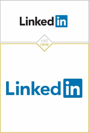

Logos With Few Colors As Possible
Being conservative with the number of colors pays off for graphic designers who design logos.
If you would like your logo to be perceived as modern, then your better off making it with as few colors as possible. Ideally, a logo only features one color, but that is not always possible. A two-color logo where the second color is only used sparingly is still on-trend.
I hate this trend, but it is what it is. Going with one color may work for a brand as big as the state of Colorado; people recognize big brands so those organizations do not have to worry about being visually distinctive. But start-up brands need to be visually interesting so they can be memorable. It is hard to accomplish that when you take away a vital tool: color.
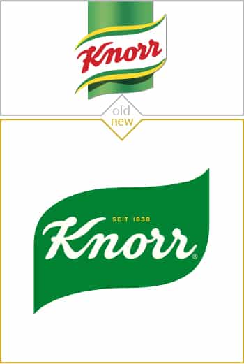
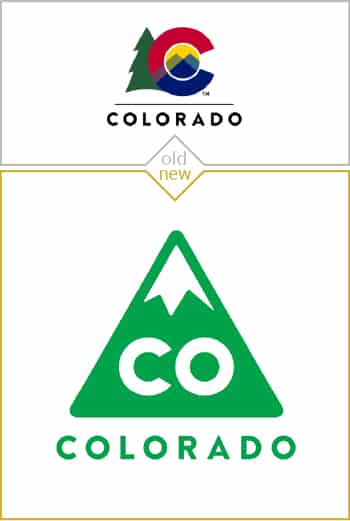
Flat Logos Are Preferred Over Rendered Logos
Computer rendered logos were all the rage a few years ago, but now flat logos are in.
A few years ago, graphic designers with a bit of skill in 3D rendering were considered gods. Everyone loved the logos that looked like real objects like a car emblem or the globe.
Well, uninstall 3D Studio Max because flat logos are the new hotness. Simple logos with no shadows, reflections, or gradients are considered modern in 2020.
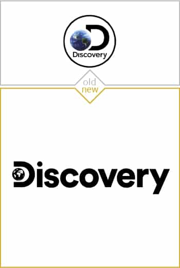
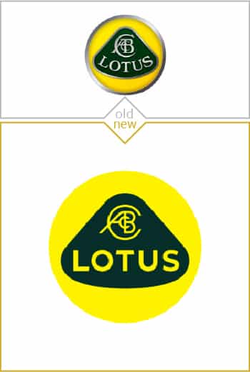
Logomarks With Simple Linework
Logos that feature simple, uniform linework are preferred in 2020.
Logomarks usually have some substance to them. They are a block of color with some design elements carved away.
But modern logos are far lighter and somehow seem more classy as a result. Modern logomarks are simple lines of a consistent thickness arranged in perfect proportion. These logos are challenging to design, but look great if you can pull it off.
Straight Lines As Elements
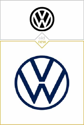
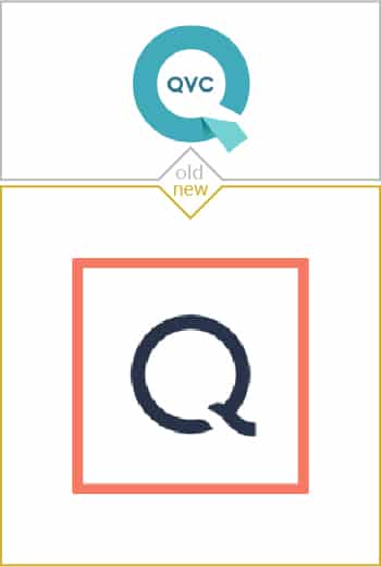
Straight lines make classy elements in modern logos.
There used to be more of a tolerance, maybe even a preference, for visually complicated logos. Now, there is a strong preference for simple logos with very minimal elements.
The preference for simplicity means that brand designers have to be on their game; using simple elements like straight lines is challenging because they have to be perfectly placed and in perfect proportion. But if a designer can pull it off, then the brand is rewarded with a very modern logo that will stand the test of time.
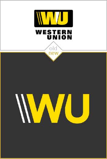
Very Simple Logomarks
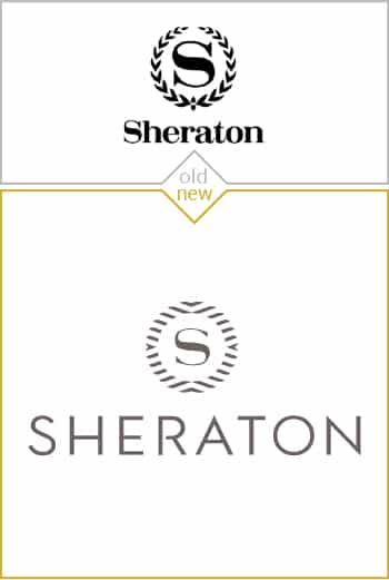
Elementary symbols make for more effective icons in this social media world.
A typical note from directors to actors is “now do less.” The idea is that powerful emotions can come out in the subtlety of the performance instead of being crowded out by overacting.
Now graphic designers are getting the feedback to do less. There are many advantages for a brand to have an simple symbol for their logo. Our brains more easily encode a simple symbol and thus more natural for people to remember making the brand more ‘sticky.’

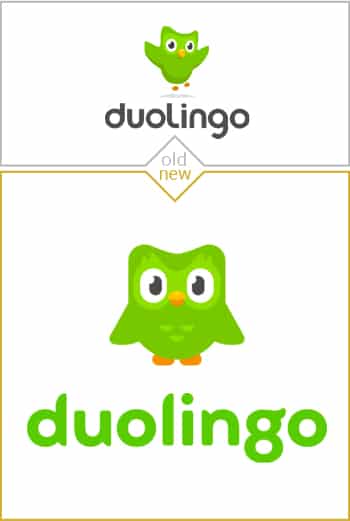
Iconic Wordmarks
Wordmarks are made simple to read as icons.
The delineation between a logomark and a wordmark is starting to disappear. Now brands are opting for their brand name designed in simple ways so that it can serve as both their wordmark and their icon.
These logos almost look like a stamp. They are simple, bold, and are still readable on a small scale.
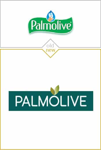
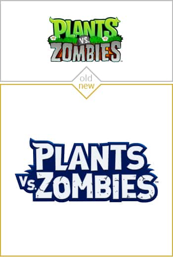
Bold Type
Thick fonts in either bold or black are more appropriate for than text with thin lines.
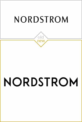
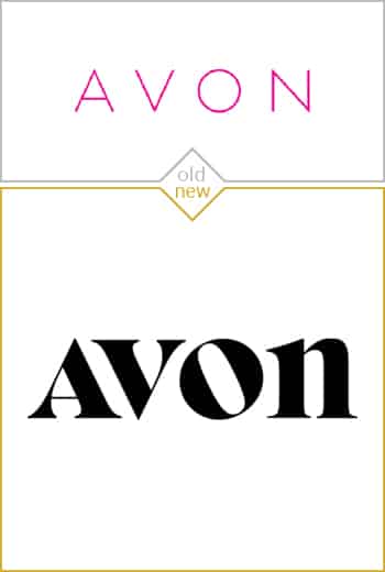
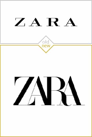
Brands like Avon and Nordstroms are paying millions of dollars to make their logos bolder.
Thin line wordmarks look classy at full scale, but just don’t work at small scales. Thin lines are also challenging when a company has to design an exterior sign for their business. Bold letters just work better for brand names.
Subtle Use of Gradients
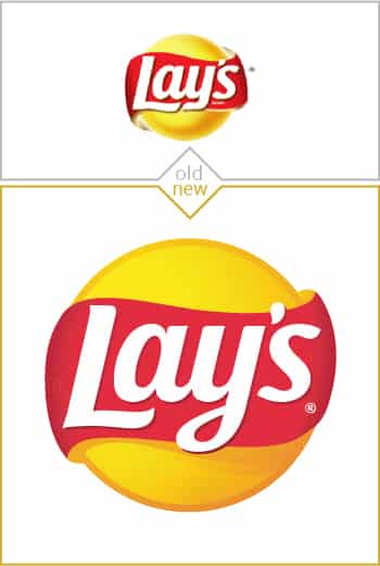
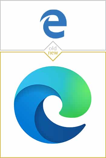
People may have preferred flat color logos for a long time, but subtle gradients may be making a comeback.
Gradients were problematic for awhile. Early computer screen and internet technology meant that gradients were often displayed as ugly steps in color rather than a smooth transition. Old, cheap technology did not render enough colors to make for a proper gradient.
Now that most people have high-quality screens on their computers, and modern web browsers support HTML5 code and SVG images, which can display much better gradients. Designers no longer have to worry that subtle gradients in logos will show poorly.
Thick Lines
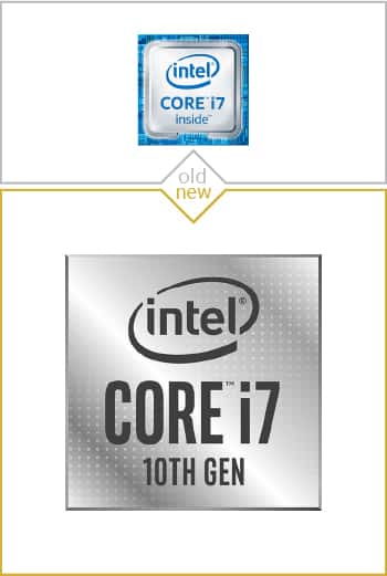
Thinner lines do not work when logos are small. Thick lines get the job done.
As a brand designer, I often start a logo by using lines that are much thinner than would be appropriate. I then zoom my design out on my computer screen and realize that the thin lines do not read at small scales, and I need to be more bold with my line work.
Companies are rebranding after making the same discovery. Their logos with thin lines just don’t work when at a small scale or when viewed from a distance. They are rebranding to pump up the thickness of the lines in their logo.

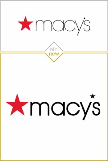
Tall Fonts
Fonts with tall profiles are gaining ground over the classic square profile letters.
It was trendy to coose a font for a brand that had letters with a square envelope to the characters. That preference meant letters that would appear as squares if you drew a box over top of them.
Now brands are more open to logos with taller letters in their wordmark. These taller profile wordmarks are a significant divergence from the prevailing aesthetic.
Conclusion. Logo designs should only be as complicated as they need to be.
A good logo is a simple logo, but a good logo is also distinctive. There is some tension between these two aspects of effective logo design. A logo needs to be a little complicated to be different and memorable.
The simplicity of a logo has never been more important than in 2020. With so many of our brand interactions being on our phones or on social media (or both at the same time), a brand’s logo is seen at a small scale more than it is at full size. The logos need to be simple in ordered to be recognizable when it is tiny.
There is a limit to simplicity. An effective logo needs to be more than just a circle or a square. It needs to be something interesting, distinguished, and appropriate. A professional brand designer should add just enough complexity as necessary and no more.
There is a limit to simplicity. An effective logo needs to more than just a circle or a square. It needs to be something interesting, distinguished, and appropriate. A professional brand designer should add just enough complexity as necessary, and no more.
Leave a Reply