Chadwick Harber, Nichole Rouillac, Grayson Byrd, Mika Becktor and Norio Fujikawa comment on the latest smart speaker designs.
Introduction
The smart speaker is a new product category defined by having a voice assistant always at the ready. “Alexa: buy some more laundry detergent,” or “Google: what is my next appointment?” or “Siri: play the Evolve album from Imagine Dragons.”
The idea of a smart assistant in the home is somehow much more powerful than the same assistant on our phones. It makes raving fans of some people; we bought our Google Home Mini because a colleague praised its usefulness in the kitchen for cook timers and recipes. Amazon was first with success of the Echo and proving the market.
For 99.9% of its life, a smart speaker just sits on a shelf, counter, table or entertainment center. Therefore, it better be a beautiful design to look at, like a vase or piece of art. That is why we are talking about these today; we can appreciate their looks because the aesthetics are part of the value proposition.
Industrial designers define the shape, materials, finishes, and details of a physical product. We have industrial designers from the top of the field to comment on the top smart home speakers.
Our design panel
![]()
Colin Finkle (Host)
Public Thinker / Creative Officer
BMB
Website | Twitter | Instagram | Linked In
While most of my day is now in marketing strategy and graphic design, I started with a degree in Industrial Design from Carleton University, and I designed for nearly ten years after. Now I am a public thinker and creative officer here at BMB. The introductions and descriptions are my words, but I’ll let the designers give their opinions and then I will determine the consensus opinion in “the verdict” section.
![]()
Chadwick Harber
Industrial Design Manager
Fitbit
Website | Twitter | Instagram | Linked In | Pinterest
When Chad Harber works with his team to design the next Fitbit, he questions every presupposition, tests every assumption, and brings a sense of craft to every detail. Before Fitbit, he worked on many projects while with the Silicon Valley design consultancy: New Deal Design. He also has experience designing a speaker with the Aether Cone (Amazon).
![]()
Nichole Rouillac
Founding Partner
level
Website | LinkedIn | Instagram | Facebook | Pinterest
Nichole is an accomplished designer and founding partner of level, an award-winning Industrial Design firm based in San Francisco. Founded with her partner Robin Hubbard, level brings 15+ years of experience distilling the world’s most complex technologies into solutions that touch millions of lives in a meaningful way. Just the lady we need.
![]()
Grayson Byrd
Lead Designer
Dolby Laboratories
LinkedIn | IDSA | Instagram
I just assumed that the products from Dolby were designed by Soundwave from Transformers. But I must be wrong because Grayson and his interdisciplinary team design products with an eye to the science of acoustics and the experiences of people with award-winning designs as a result. I think this guy has something to say about these software and web companies designing speakers.
![]()
Mika Becktor
Industrial Designer
FactorsNY / Alstad
Website | Portfolio | LinkedIn | Instagram | Behance
Mika, like every great industrial designer, designs for people and their experiences first and for aesthetics second. I can only imagine the level of craft in the experiences of the products he designs for FactorsNY / Alstad Goods because I am blown away by the visual beauty of his designs, especially those of the golf clubs for Cleveland Golf.
![]()
Norio Fujikawa
Creative Director
Astro Studios
LinkedIn | Instagram | Behance
When I, Colin Finkle, graduated from university, the most exciting place I applied for a job was Astro Studios because they had just designed the Xbox 360 for Microsoft which I still believe to be the best console design in history. Norio was a part of that and has designed many technology products in his 14 years with Astro. His fascinating art also gives us a glimpse into his mind.
 Amazon
Your old friend: Alexa
Respect needs to be given to Jeff Bezos and the people of Amazon for taking the risk that people would want a speaker in their homes that is constantly listening with a smart assistant at the ready. Although they may not hear the praise through the pile of money they are raking in with 71.9% of the smart speaker market share, according to VoiceBot Smart Speaker Adoption Report.
Amazon Echo Plus, and Amazon Echo Dot
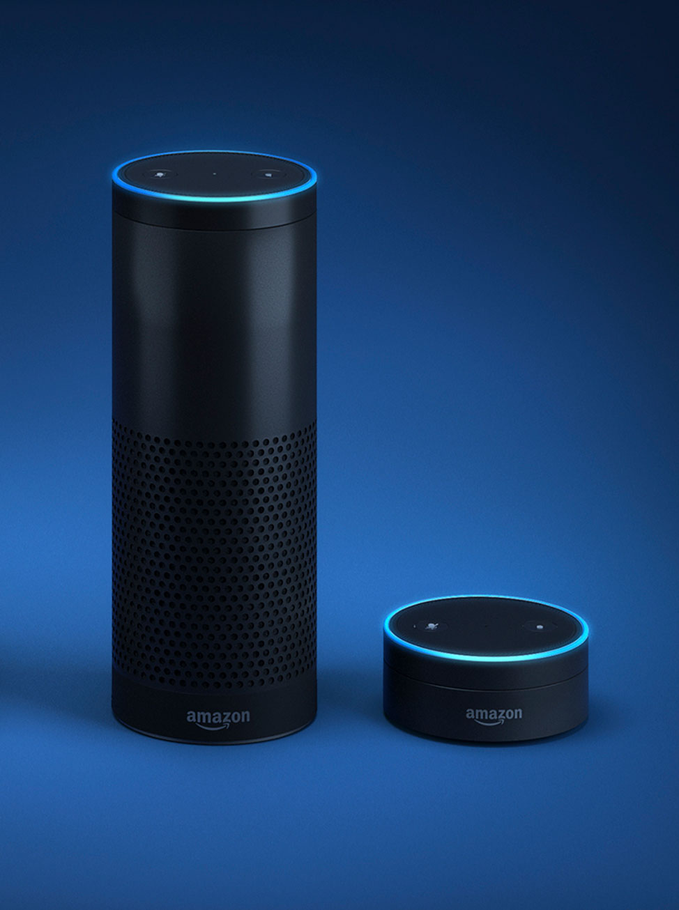
Photo courtesy of Amazon. © 2008-2018, Amazon.com, Inc. or its affiliates
There is an entire line of Amazon Echo speakers, but we are going to focus on the Echo Plus and the Echo Dot. They are both cylinders with a ring that lights up and animates to show you Alexa is active. The only buttons are a mic off and action button, the rest of the interaction is up to the user’s voice. The Echo plus is tall enough for a speaker grill, which is a simple offset grid of circular perforation. It can be finished in white, silver or black, but our industrial designers are commenting on the black version.
What do you think of the design?
 Chadwick Harber
The worlds 2nd voice-activated speaker after the Aether Cone ;-), this tubular Pringle can proportioned monolith is one of my least favorite design of the bunch. The combination of its heavy-handed perf pattern, Black CMF (I know there are other ones now) unstable and tall extruded form and overtly tech feeling blue ring all contribute to an object that feels more like a piece of networking equipment then an object for the home. The puck somehow works more for me but still don’t want to look at it. However, it works better than the rest, and I guess that’s why people put up with it!
 Nichole Rouillac
Echo’s product DNA suggests the presence of a cold artificial intelligence inside. The blue light ring shows off its awareness of the user’s relative location and presents 360-degree interaction. This capability is not unique amongst its competitors; however, it does make the Echo feel more conscious than the rest. Within the home, the design is sterile, lacking warmth and a human quality.
 Grayson Byrd
Ah yes, the pioneer of smart speakers. I like the tall, skinny stature of the Echo Plus. Its small footprint would fit in more places in my home than say, a short, fat one. I also dig the signature light ring. It sets itself apart from others and gives it that nice “smart” factor.
 Mika Becktor
Clearly designed to just blend in with the wires behind your TV. The cheap looking Amazon logo decal is not doing the product any favors either. Either embellish the logo to make the product look more valuable or make it stand out less by doing a tone on tone for a classier look.
 Norio Fujikawa
You have to give credit to Amazon for being arguably the first to dominate the category. It is a straightforward, no-nonsense aesthetic that works as a serious smart device, although, the industrial design feels a bit counter to what is meant to be a helpful and friendly UI.
The Verdict
Full praise to Amazon for starting the category, but it’s time to make the home for Alexa a little less Hal 9000 (cold and creepy) and a little more EVE from Wall-E (friendly and modern).
 Google
Coming slightly late but with a briefcase of data
The Google Home Mini is the smart speaker we invited to the Finkle household, and we use it every. Why his speaker? Because Google knows everything about my wife and I because of our use of Gmail, Google Calendar, and our Android phones. That’s is a lot of data that we trust Google with!
We are not alone, and the ability to ask a virtual assistant about our appointments and get custom responses is powerful, and that power has propelled Google from playing catch up to being number two in the smart speaker market.
Google Home and Google Home Mini
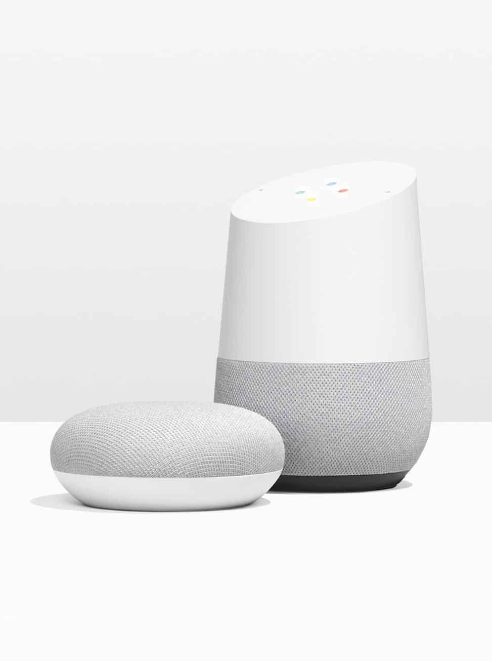
Photo courtesy of Google. © Google LLC
The Google Home and the Google Home Mini are the most sculptural of the smart speakers on display. They are cut into unique forms that are hard to describe. The designers of the Google Home must have recognized that 99.9% of a smart speakers life consists of sitting on a shelf, countertop or entertainment center, just looking pretty. A smart speaker is more similar to a vase than a tech product regarding its functional life, so it needs to enhance our home.
Both the Home and the Home Mini hide their buttons; the Home has a flat top with capacitive touch and lights to indicate places to interact while the Home Mini covers over the light touch buttons with fabric. No cut speaker grills here; just a light grey fabric.
The top of the Home is always white, while the bottom can be customized with colored metal bases. The Home Mini can be purchased in white, black or an orange-red that Google calls “Coral.” Our designers will be commenting on the white versions of both.
Buy the Google Home for $149 or the Google Home Mini for $79 from the Google Store
What do you think of the design?
 Chadwick Harber
I prefer the mini to the original vase shaped design. There is something warm and more humane in the humble fabric cupcake that sits on a table. The use of textured white plastic with fabric is working nicely here. There is a more feminine identity to these objects which I like. The interaction lights are subtle and leave no trace when not in use.
 Nichole Rouillac
The Google Home speakers are well crafted, vessel-like forms that feel appropriate for the home. We love the use of textiles and feel the integrated touch interfaces provide an element of magic. The warm tonal grey palette is very successful in blending with the home environment. We see this as just the beginning of Google’s vision for the future as they work to make tech more friendly and approachable.
 Grayson Byrd
Honestly, I’m torn. I love the Mini, but the Home is a bit too bubbly for me. It’s clean, and I applaud the fabric choice (feels less like a speaker and a bit more “at home”), but at the end of the day it just looks like a diffuser. Give me 4 Minis over a Home any day.
 Mika Becktor
Google has actually done a pretty nice job of introducing textures and fabrics to their tech products which is a nice touch, pun intended, and gives it a warmer and homier feel than your run of the mill injection molded plastic finish. The mini is probably my favorite design out of them all while the Google Home looks an awful lot like a water carafe.
 Norio Fujikawa
What’s working: Home and Mini express a simple design language that I’ve come to expect from Google. What’s not: it seems derivative of the modern aesthetic that Apple was once known for.
The Verdict
The praise for the Home and the Home Mini’s warm and inviting designs is unanimous. The Mini’s shape seems well-loved, but the Home’s form has its detractors. These are amazing first efforts from the Made by Google design team, and by far the friendliest designs of the products here.
 Apple
Apple
Finally, iPhone users have another device to forget to use Siri on.
Why are we writing this article now? Because of the launch of the Apple HomePod. Talking about smart speakers before Apple entered the market would be like the Grammys without Beyoncé. I suppose it can happen, but what’s the point?
The tech journalists knew Apple was going to make this product, and the expectation was that Johnny Ive, the chief design officer, would wow everyone with a simple and elegant piece of technology we would all want in our homes. But, Apple came late to the party with the HomePod and the eager tech journalists responded with a deflated “meh.” Let’s see if our designers embrace the HomePod more than the reviewers have.
Apple HomePod
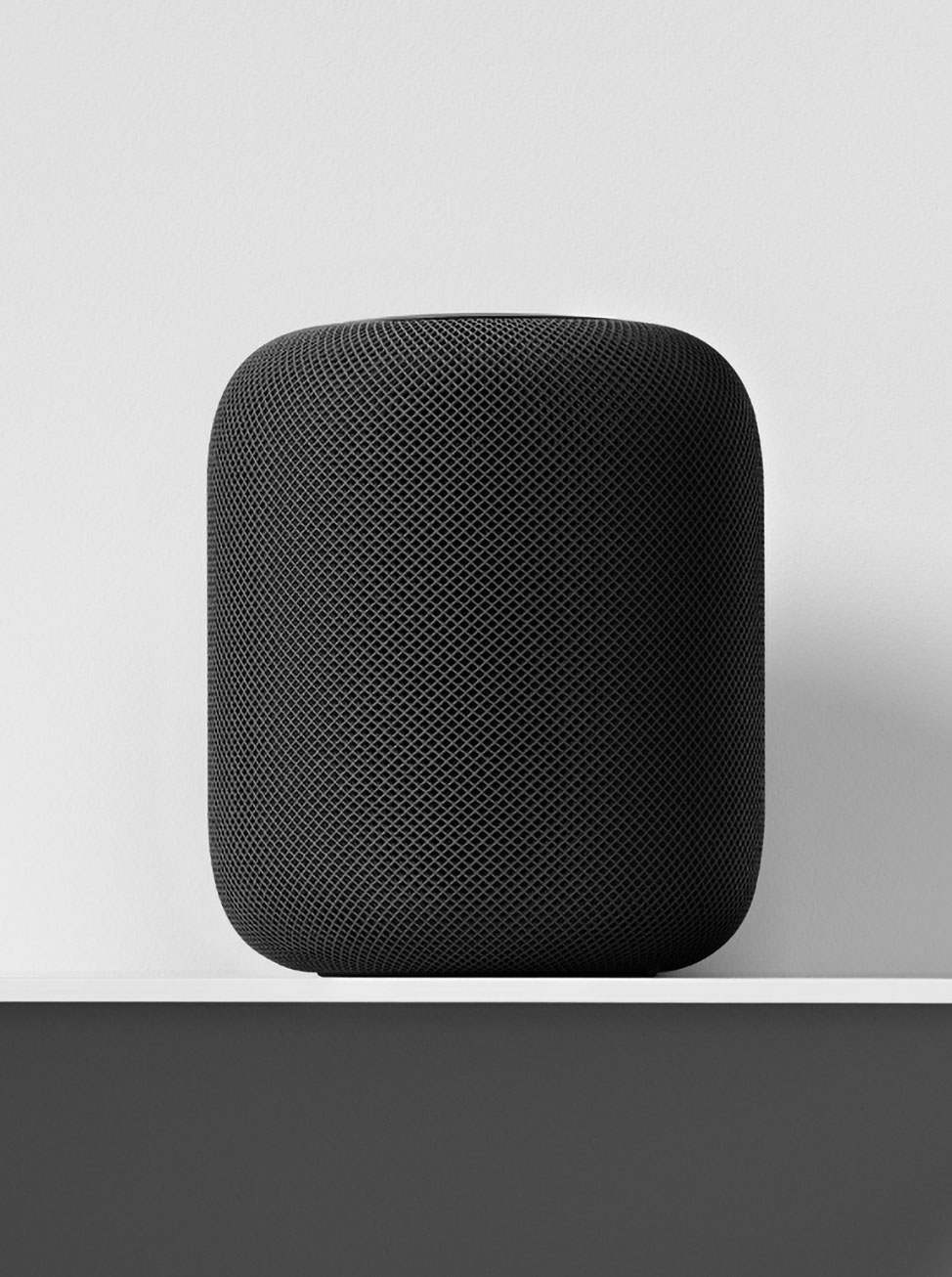
Photo courtesy of McDonald’s Canada. ©2017 McDonald’s Corporation. All rights reserved.
Apple talks about the engineering innovations at length but only gives passing mentions to the design choice; I think it is a safe assumption that the acoustic engineers dictated the structure and the designers wrapped the speakers in a skin that does not call attention to itself. That skin is a custom seamless mesh fabric.
The form is a cylinder with a smooth blend into the top and bottom. The top is a circular touchscreen showing either the animated Siri clouds or volume up and down icons. Apple mentions that is fits in every room regardless of the decoration scheme by being able to be ordered in white or black. Our commentators are looking at the black version.
Buy the Apple HomePod on Apple.com for $349
What do you think of the design?
 Chadwick Harber
My favorite of the bunch. Quite different in form from their first iPod speaker. The HomePod has the proportions of a marshmallow that is wrapped in a sporty geomesh fabric that seamlessly envelopes it. The ambient display has nice effect but is only visible if standing over it. Details as expected are flawless in execution but this doesn’t feel like Apple at its best. I’m missing the visceral aspects that I’ve associated with their products in the past. The form and CMF are less Germanic and softer (literally) in approach than typically seen from Cupertino, however, the design feels right for the home even though something is missing. I question whether fabric is a designers best tool to make a consumer electronic device feel like furniture? An architectural shift in speakers is seen with these voice-activated machine learning devices in the sense that they are 360-degree products compared to the directional “dumb” speakers that preceded them.
 Nichole Rouillac
Of all of the home speakers, Apple has, as usual, executed the highest perception of quality through material, audio, and technology innovation. That said, Apple is undoubtedly late to the game, with a product that feels expected. Overall we appreciate the high bar set by Apple’s hardware execution, as well as the simplicity and austerity of the design.
 Grayson Byrd
I appreciate the unique mesh fabric up close as well as the seemingly simple form from a few steps back. I like that it does little to command attention. Now, if only Apple were open to natural, earthy tones with cool paint names like “Mekong Moss” or “Oxblood.” Going all black is the safe play and too much like every other speaker out there.
 Mika Becktor
Not a huge fan of the giant blend trend on recent Apple products including the latest iPhones, Apple watch, the MacPro and now the HomePod. I can’t decide if it’s discrete or interesting enough to have in a central area of your home. You kind of want one or the other, the Apple HomePod might have missed the mark on both.
 Norio Fujikawa
Apple has historically set the bar for design, but HomePod is surprisingly generic. However, it is well executed with masterful attention to detail.
The Verdict
Top marks to Apple for execution and eye to details (as always), but the shape is boring and expected, much like Apple’s entry into the market. Design expectations are always unreasonably high for Apple; I am sure all of our design professors endlessly praised the design thinking from Apple.
 Sonos
Sonos
The company you just heard about but has been making speakers smart for over a decade.
Those who know, know Sonos. You might not have heard about them, and that is okay; I had only paid their displays in Best Buy with a passing glance. Sonos has been putting computers in speakers for nearly 15 years, not to host voice assistants but to connect the speakers to the web so customers can pull music from wherever they store it and play it wherever they are. Sonos fans would have multiple speakers around their house from the company, and they could listen in whichever room at any time. The Sonos One adds Amazon’s Alexa voice assistant to further their goal of delivered music.
Sonos One
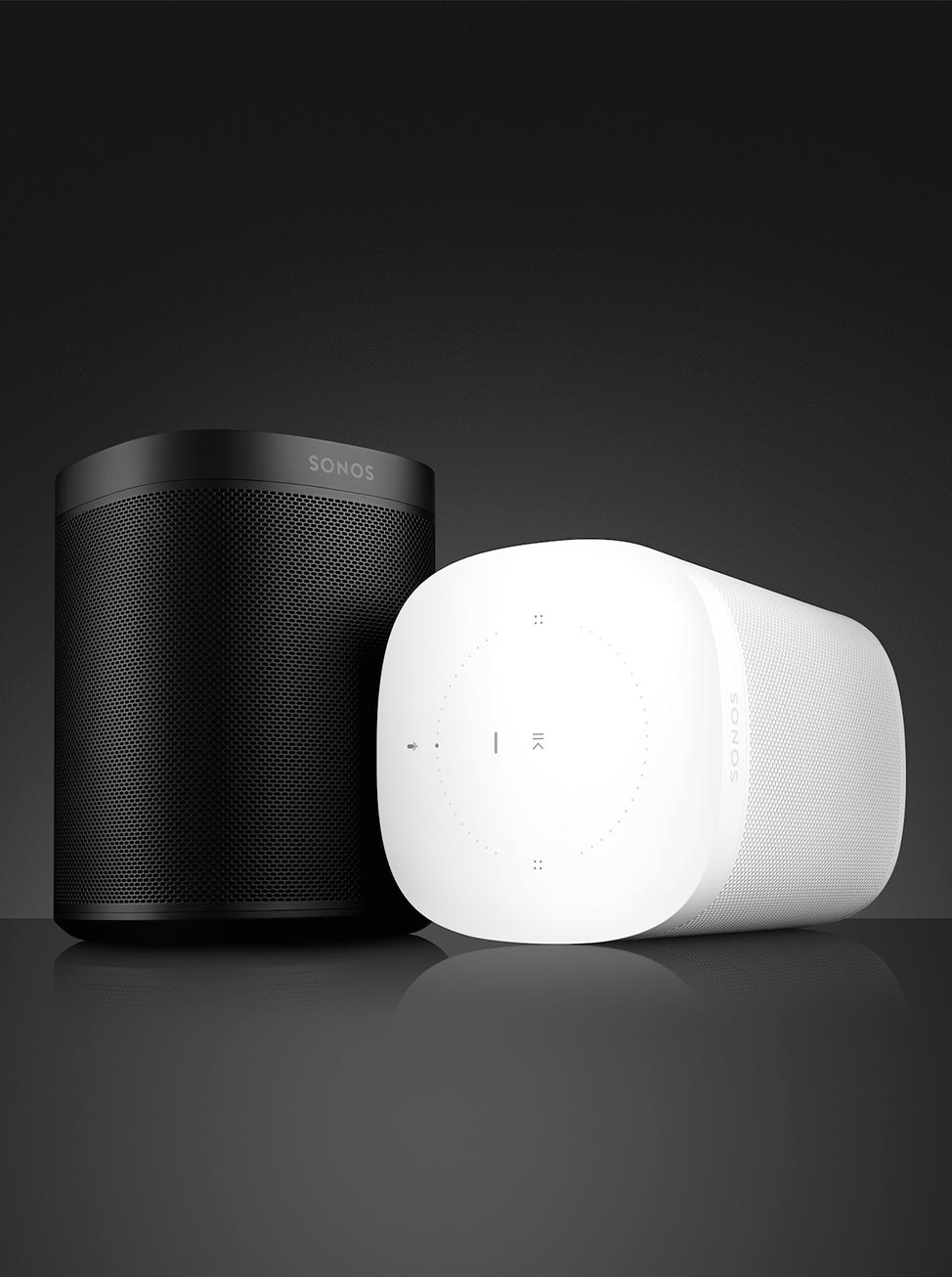
Photo courtesy of Sonos. © 2004 – 2018 by Sonos. Inc.
To call the Sonos One’s form a square extrusion is accurate but does not do it justice. It’s shape from the top down is a square but with a continuous curve blending each side into the other. The product’s sides feature perforations that remind me of links in a chain.
The speaker has weighty presence due to its proportions which would be a problem if it was larger. It is only little larger than a quality monitor speaker would be for a surround sound system. It’s clearly meant to blend into the environment; finding the speaker in Sonos’ press photos where the speaker is in a room can be a bit of a Where’s Waldo game.
The top features a capacitive touch surface with graphics to indicate the touch points for the mic, play / pause, and left and right menu buttons. A ring of dots calls back to the Bang & Olufsen design of the click wheel which was eventually popularized with the iPod. Another similarity to the classic iPod is that the One comes in black and white, and our commenters have seen and are referencing both finished in their answers.
What do you think of the design?
 Chadwick Harber
The original connected speaker! Braun approach to blending into its surroundings and hearing sound, not necessarily seeing it. I really liked the colors from the HAY collaboration in Milan this year, and I much prefer the monochromatic approach to CMF versus the original white or black with a silver metal mesh. The controls are nice and simple, but I don’t appreciate the scalloped surfacing around the buttons. The inflated form adds a friendly feel to its overall character.
 Nichole Rouillac
With years of experience in connected audio, Sonos is known for offering a seamless and reliable ecosystem of audio products for the home. The Sonos One continues this heritage, with prescriptive design DNA and a familiar user experience. It’s monolithic and well constructed. We especially like the recent colors launched in collaboration with HAY—the warm metal color palette feels fresh and appropriate for the home.
 Grayson Byrd
Very nice. Just the right amount of attention was paid to the icons and perforated pattern- nothing too crazy, but still unique in their own right. Unfortunately, the clean, hard lines and metal grille make it a bit too cold for my taste. It’d definitely work on a nice marble table. This should come with a nice marble table.
 Mika Becktor
Sonos does a nice job of making their products look clean and valuable, branding is subtle and clean thought the UI on this specific model reminds me of a certain product from 2001 that put “1,000 songs in your pocket.”
 Norio Fujikawa
Look, it’s the square one! It’s a clean approach with a combined balance of Sonos’ design heritage with Amazon’s built-in Alexa.
The Verdict
The Sonos One is well liked by our panelists. It’s simple, bold form was praised, and the level of subtly of the grill, branding and user interface is right to the designers’ tastes. This is the smart speaker to get if you would like to be one of cool kids.
 harman / kardon
Follow along: harman / kardon, by Harman, a Samsung Company, uses Microsoft’s voice assistant. Huh?
Sometimes mergers and acquisitions can get in the way of common sense in marketing and product design. Harman was purchased by Samsung in March 2017. The Harman / Kardon brand came with and got stuck with the “by Harman” master brand. (Psst! Samsung, give me a call, and we’ll sort out your brand relationship strategy.)
Samsung has a voice assistant called “S Voice” found in their Galaxy line of phones. But this speaker does not feature S Voice; it is the first speaker features Microsoft’s voice assistant: Cortana.
Leaving all the complications behind, Harman / Kardon has a history of making speakers with distinctive designs. Does the Invoke fit into that legacy?
Harmon Kardon Invoke
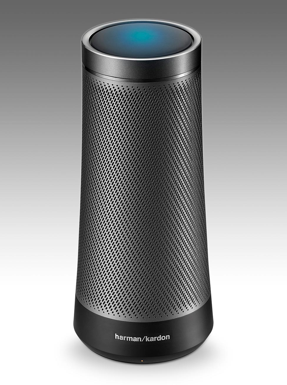
Photo courtesy of Harman Kardon. © 2018 Harman International Industries, Incorporated. All rights reserved.
The Harman / Kardon Invoke has a masculine presence. It is a tapering cone with a slight curve to its profile. If you get it in it’s “graphite” color option, then it is planted by its black base, and a unique pattern of perforations travels up the silver sides. The top section is defined with a recessed ring and on top of that cap is the touchscreen that shows the blue gradients when Cortana is active.
While you would except the most distinctive design from Harmon / Kardon of all the brands here, their speaker actually makes the most references to computer speakers of all the models here. It is available in “pearl silver” with a white base or “graphite” with a black base; our commentators are reviewing the graphite model.
What do you think of the design?
 Chadwick Harber
This object lacks emotion and character. Another tall proportioned form that feels very CE (consumer electronic) and not in a good way. Do people really want an iron man heart pedestal in their kitchen or living room? Compared to the others there is no magic in the way it’s crafted. Material breaks are obvious, and the materials are expected. Harmon Kardon makes great sounding speakers and I expect no less from this. As with the others, I’m lacking a connection to the object. Why is this meaningfully my life? How will it bring me delight and joy?
 Nichole Rouillac
The Harmon Kardon Invoke is the least appealing of the smart speakers we reviewed—overly expressive and sculptural, it’s cluttered with too many parts and details fighting for attention. It feels tasteless and foreign in the home.
 Grayson Byrd
This isn’t a smart speaker, it’s an air filter. I have a natural disdain for objects that try to do too much- especially at this scale. No, this doesn’t sit on the floor in the corner of your room. It’s a small, tabletop object and its busy nature bothers me. From all the part breaks and material/finish differences to the complex perforated pattern and contrasting logo- I don’t know where to look and prefer to look away.
 Mika Becktor
Rather than going for a more friendly looking perforation pattern (circular holes) Harmon/Kardon went for a more aggressive design. Hopefully, they have the pattern patented because I hear Gillette is interested.
 Norio Fujikawa
Not quite a pure cylinder like Echo and not quite as simple as Home but a solid, familiar player in what is a crowded market.
The Verdict
Not a lot of love for the speaker from the beloved Harmon / Kardon. Our panelists agree that it is calling too much attention to itself, and then it’s visual complexity overwhelms the sculptural form. I am looking forward to generation two of the Invoke.
 BONUS ROUND
Amazon
Thankfully, someone is teaching our kids to say please and thank you.
This is just a fun aside. I have a three-year-old, and he is fascinated with our smart speaker. He has actually said goodbye to it when we have left the house, which makes me wonder if he thinks someone is living in there.
Well, Amazon has clearly listened to the kids using their parent’s Echo and developed an echo that provides safe content for the kids, and keeps itself safe from the kids with a rubber case. It focuses on educational audio content and actually rewards kids for asking with a “please.” Whether or not we want our kids so connected is a valid question, but if the answer is yes, then Amazon has a product for connected kids.
Amazon Echo Dot Kids Edition
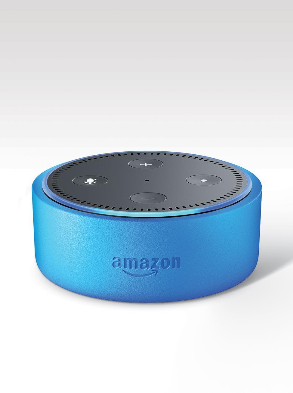
Photo courtesy of Amazon. © 2008-2018, Amazon.com, Inc. or its affiliates
The Amazon Echo Dot Kids Edition is just an Echo Dot with a blue, red or green rubber case. Our commentators saw it in blue.
What do you think of the design?
 Chadwick Harber
Put a primary colored beer cozy on it and ship it.
 Nichole Rouillac
Same as above on the Echo. The materials look cheap, like a pool toy. Does anyone really want this technology for children? Parents should discourage children’s tech addiction. The Echo Dot feels like bad tech hygiene. It just doesn’t make sense.
 Grayson Byrd
Is this just the Dot wrapped in a rubber sleeve? Cute, but lazy. Next, let’s top it with Milk-Bone crumbles and call it, “Dog Edition.”
 Mika Becktor
Actually, I love how the recessed amazon logo with the smile arrow looks on this kids edition. The logo really lends itself nicely to less serious and more playful products.
 Norio Fujikawa
Look, it has colors!
The Verdict
It probably isn’t fair to have the Echo Dot Kids Edition in the running, because the innovation is on the kid-friendly media it plays, and not the industrial design. But the colors made it fun for some!

Leave a Reply