
Considering context, competition, culture, contrast, color gamut, and company to choose the best colors for a brand.
Abstract | Executive Summary | TL;DR
A brand’s choice of colors can help engagement and send signals. A study shows that more than half of a person’s assessment of a brand is based on color. The goal of color choice should be strictly on attracting the desired people, not on personal preference.
There are six considerations when choosing colors:
1 | Context: where and how the colors will show up
2 | Competition: the relationship with the colors of adjacent brands
3 | Culture: the meaning of colors within a culture
4 | Contrast: choosing multiple colors that work together
5 | Color gamut: whether or not a color is replicable
6 | Company: the fit with the people of the organization
A professional designer should know the culture and color theory required to choose appropriately. Professionals need to expect this from the designers they work with. A brand designer needs to be both an analyst and an artist.
Colors can make a brand feel meaningful or hollow, exciting or boring, bold or meek. People make snap, emotional assessments of brands the moment they lay eyes on them, and most of the information they are basing their judgment on is communicated through color.
So, when it comes to choosing colors for a brand, there is nothing quick and easy about it. I find this to be true even after having determined the colors for over a hundred brand identities. This isn’t a surprise given that 62-90% of an individual’s assessment of a brand is based solely on color, per Professor Satyendra Sing in a paper titled “Impact of color on marketing.” Beyond the difficulty in choosing the best colors to represent a brand, Professor Sing’s statistic suggests that the colors chosen to represent a brand play a core role in the brand’s success.

Combine the difficulty of choosing a brand’s colors with the importance of color, the process of selecting a brand colors often leads those making the decisions feeling bogged down ending in middle-of-the-road/bland choices with most brands choosing blue.
” Color is such a critical factor in branding, so much so, that brands have even tried to trademark their exact color. T-Mobile did it somewhat successfully with their magenta, yet Cadbury is struggling to do so for their decadent purple. Whatever the result, the power of color is undeniable, so follow these 6Cs carefully.”
Jacob Cass
Founder & Creative Director of JUST Creative
Read “Color Psychology in Logo Design & Branding Explained ” by Jacob.
The six Cs of consideration, which are listed below, guide brand designers and professionals working with designers in making color choices for brands:
- Context: where and how the colors will show up
- Competition: the relationship with the colors of adjacent brands
- Culture: the meaning of colors within a culture
- Contrast: choosing multiple colors that work together
- Color gamut: whether or not a color is replicable
- Company: the fit with the people of the organization
You have to be both an analyst and an artist while choosing colors. It is possible to select a great pallet for a brand if you have a handle on the six Cs and being committed to picking something special.
The goal of color: engagement
The only goal when choosing colors for a brand is to draw-in a targeted selection of people to engage with the brand.
We want people who are unaware of the brand to see the colors and investigate more, and we want people who are already engaged in the brand to keep doing what they are doing.
The pretty color fallacy

Most people believe the most important consideration when choosing colors is if they are pretty. Some think this is the only consideration. This is not true.
Picking colors you find beautiful is essential when you choose colors for your home décor. But this does not carry over when selecting colors for marketing. The right decision for the brand might mean choosing colors that you do not personally find attractive. They might speak to your target market or support your message.
Pretty-for-pretty-sake colors on their own will not support a business strategy; preferably, the colors chosen are chosen because they will attract a particular type of customer, speak to brand personality, support brand differentiation, and for many more reasons.
The worst part of the pretty color fallacy is that it promotes subjective feedback in brand design decision makers such as “it’s not pretty” and “I don’t like it.” Everyone is entitled to their opinions on color. We all assume that if we don’t like the colors, then no one will.
When asking for feedback on color the input needs to be limited to: “does this speak to the audience we are targeting?” The only subjective opinion that should be considered is someone within the target market, and, even then, it should be in aggregate within market research.
The 6 Cs
Six things to consider when choosing colors for a brand.
Context
Considering when and where the brand is displayed.
To avoid a brand’s colors being a liability, a designer must consider the context, or the where and how, of where the brand colors will be displayed. Considering the context of a brand’s colors will allow the brand to both fits in and stand out appropriately.
When considering context, the designer needs to know what/which location(s) the brand will be displayed. Brands can be presented in any environment; however, there will be few key environments where the brand will need to shine. The primary environment is the context that you will want to consider when choosing brand colors.

Let’s work through some examples from my work:
Strike Team | eSports brand | Arenas
Nordeau | Ski/snowboard lifestyle brand | Ski resorts, snowy mountains
Coach’s Advantage: Soccer | Soccer Skills and Plays | eCommerce

Strike Team
The primary environment, or context, of the typical eSports arena is dark and blue, so light yellow was chosen to cut through the darkness and get noticed.
Nordeau
Being a ski/snowboard lifestyle brand, the primary environment/context is the white of the snow and the blue of the sky. To contrast against the white of the snow and the blue of the ski, an orange-red was a chosen as it both fit the bill and was unique in the industry.
Coach’s Advantage: Soccer
I used soccer as the inspiration for the color pallet, but I made the primary green far brighter than is typical in grass or turf. This was because I knew the product was a digital good, allowing me to choose colors that display well on screens, lime greens being one of them. Our business objective was to improve engagement from search traffic, and an arresting lime green supported that goal.
The context of a brand can be a great source of inspiration for colors. If a brand is to be associated with a particular environment, then a designer can pull in colors that remind people of that. An example of this is the ‘Flint Stone’ grey I chose to be the accent color for Nordeau which was inspired by the rocks of a mountain, and the greens of Coach’s Advantage came from a soccer field.
An easy way to make sure you consider context is to pull a picture of the environment and put it under your colors. I typically use Adobe Illustrator when choosing brand colors, so I will grab an image and paste it on a layer below my active layer, and then lock the layer. If the colors are working when displayed on the picture, then I am confident they will work in that environment in real life.
Beyond the environment in which the colors will be displayed, it is essential to consider the medium, or the how and on what, the color will be applied. Will the brand mostly be on screens? Will it be printed? Will it be embroidered on fabrics? All of these can affect colors. The medium is important because some colors may not be able to be reproduced in some contexts. I explain why in the color gamut section of this article.
Another context consideration is if the color(s) is/are going to be feasible at scale. For example, if someone is designing an apparel brand, then the color they choose for the logo needs to be available in fabric and embroidery thread. Custom colors and finishes are always available, such a custom powder coat color, but with added cost – both financial and lengthening the timeline.
Though a designer is not expected to know of every opportunity and limitation of the context of a brand they need to do more than flip through a swatch book at their desk, a professional designer should consider taking a field trip with that swatch book into the environment for some context. Marketers and entrepreneurs should require this thinking.
Competition
Signaling that you are different from your competition through your color choice.
A brands colors relative to its competition says to potential customers either “more of the same” or “I am not like the other guys.” Therefore, the colors of the competitors must be considered when choosing colors for a new brand or a rebrand.
MailChimp recently rebranded and their colors were one of the many things they changed. Freddie, Mailchimp’s mascot, ditched his blue hat to make way for an intense yellow. The motivation for Freddie’s hat change was likely Mailchimp wanting to be different than their competition. Blue is the default for the brands of the email marketing sector.
Constant Contact: Blue
GetResponse: Blue
AWeber: Blue
SendInBlue: Blue
Infusionsoft: Purple-Blue
ConvertKit: Pink
Drip: Bright multi colors
MailChimp: Yellow
By bucking the industry and using yellow, Mailchimp says “hey, we’re different!” ConvertKit, Drop and Infusionsoft makes the same statement by choosing colors other than blue.
A responsible designer will to do some homework and make sure that they are not using colors too similar to their competition. To assist with this, I generally have competitors’ logos off to the side of my Adobe Illustrator workspace when choosing colors for a brand.

Though differentiation from the competition is quite valuable, there are some excellent reasons a company may not want to differentiate from its competition. There may be strong associations with particular colors in specific industries, and incorporating these colors are essential, consider products used in health care, breast cancer campaigns, etc.
‘Regression towards the mean’ is a constant force when choosing colors. Decision-makers will default to the standard colors of their industry. A company that may want to differentiate themselves may end up with standard colors if their strategy isn’t explicit.
So, the best practice is to ensure that the critical decision makers decide whether their brand needs to be different or consistent with the industry. The project brief or strategy outline should state the decision to the same or different than the competition. If the strategy is written down, then the designer can say: “the project brief says you wanted to be different. Why are we choosing your competitors color?”
Competition and industry norms are essential considerations, but it can present a fun challenge. “What colors can we choose that will really differentiate us from these knuckleheads?!” Our competitors can challenge us into more bold decisions, and that is awesome.
Culture
The meanings of the colors within the culture the brand fits into
Designers have to have a strong sense of their culture’s associations with colors and choose colors that maximize cultural associations to the brand’s advantage. Failing to consider culture may unwittingly place the brand in conflict with the culture they want to be a part of.
Part of the reason color choice is so important is that colors can elicit common and strong associations, emotions, memories, and meanings. People associate feelings with colors based on their past experiences. The people of cultures have shared experiences: the red of fire trucks, the yellow of Amazon, the pink Barbie packaging, black iPhones, and the rainbow flag of Gay Pride.
For example, green is heavily associated with the culture of environmentalism. It is natural (no pun intended!) to use a green leaf or some other symbol of nature to represent an environmental organization. Given the widespread use of green by environmental organizations, it is no wonder people associate green with environmentalism.
Even though there is nothing implicit to the color green to link it to reducing CO2 emission or recycling, we would say someone is “going green” if an organization made those things priorities. It is so pervasive that if a brand chooses green for their brand color, we assume they have something to do with environmentalism.
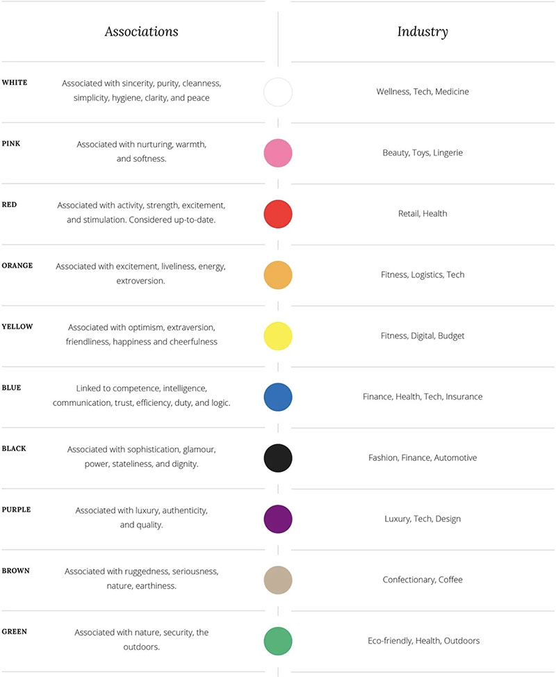
Different cultures have different associations with colors. For example, Canadian and Asian cultures with respect to “joy.” If someone asked me to name a color that represents luck and joy, as a Canadian, I would say a golden yellow. But Asian cultures associate joy and luck to red.
If your brand has a localized presence, then you need to consider the culture of that area when choosing colors. For example, the people of Pittsburg, PA have a unique relationship to the color yellow as a result of it being a prominent part of their sports teams: the Pittsburg Steelers, Penguins, and Pirates.
These associations are tough to get a read on; I wish there were more scientific research on this topic. Please, comment or contact me if you know of some research. Many infographics are using big brands categorized by color to make some statements about each color and its associations. These aren’t a bad start, but they assume a lot.
One of the most objective and effective ways to navigate color associations is to ask a broad group of people for their impressions of your color choices. You may find that multiple people associate the colors you chose with things you didn’t anticipate, and thus are left with feelings you didn’t intend. Or, the color choices worked out just how you planned.
Contrast
Marking sure you choose colors that work with each other.
You need to choose multiple colors for your brand, and those colors need to have appropriate contrast so that they work together. Otherwise, you may choose colors that blend into each other or fight each other. Properly contrasting colors make each color appear better to the eye.
Do you need multiple colors for a brand? Yes. A brand’s logo may be only one color, but you still need to choose colors for backgrounds, header backgrounds, links, accent colors, etc. Even if you display everything on a white background, then you have chosen white to be a brand color.
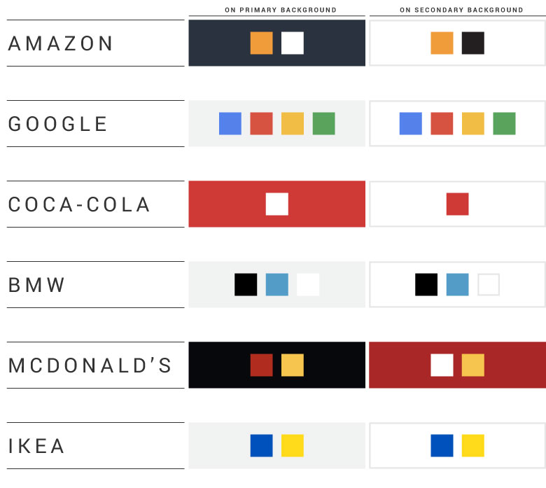
For example, when you think of Amazon, the color yellow pops to mind – it is the color that defines their brand. Note though that the letters of their logo are black, and that counts (I know, technically black is a shade, not a color)! The header of Amazon’s website is a blue-grey which is a great color to compliment and make their brand yellow look brighter and more impactful. This pallet of colors makes up their brand colors, and they work together because they contrast.
Let’s define some terms:
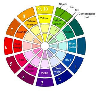
Hue: the spectrum of colors. Red, orange, yellow, green, blue, purple and everything in between. “The hue of the logo is a rusty-orange.” Scientifically, this is defined by the wavelength/frequency of the wave of light.
Shade: how dark any color appears. “They use a dark shade of blue as a background.” Scientifically, this is defined by the amplitude of the wave of light.
Tint: How light any color appears. “The red it tinted to make pink.” Scientifically, this is how pure the wavelengths of color are.
Combine these dimensions, and you have all the colors of the universe. Contrast is simple; make sure you vary hue and/or tints and shades. If they are similar, then they won’t contrast each other and will blend in. If they are different, then they will contrast.
Did you choose a bright color? Then try displaying it on a dark background.
Did you choose yellow? Then maybe a dark purple will bring it out.
Did you choose a dark shade? Then display it with a light tint for the most drama.
Varying hue, shade, and tint across the brand colors will make sure the colors are contrasted, and that is a big step in making sure they work with each other. Choosing colors that work with each other will help out a brand tremendously.
Color Gamut
Out of Gamut. Some colors are not on the menu.
Color gamut is the entire range of color that can be displayed using a monitor or a printer. You may be asking: “but Colin, can’t my screen display every color, and my printer print every color?”
The short answer is no.
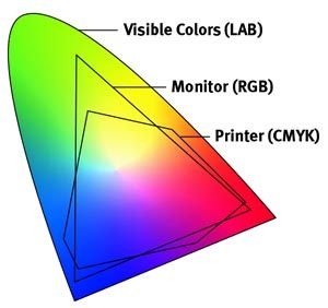
The nuanced answer is that your screen is closer to displaying every color, but your printer is nowhere close to being able to print every color. Professional printers can use special inks to print more colors.
Both monitors and printers have colors that are out of gamut, meaning that even though you can find them in the real world, they are never going to show on a screen or printed page.
Light is made of up electromagnetic waves, and different colors have different wavelengths. Adding multiple wavelengths of light together to get other colors is called Additive Color. Screens use additive color by making all colors using combinations of red, green and blue (RGB) light. Every pixel has three microscopic light bulbs: one red, one green and one blue. Our eyes only have receptors for red, green and blue so this works pretty well; hence screens are closer to being able to render all real-world colors.
Printer inks absorb colors of light leaving the color that is being displayed; this is called Subtractive Color. White light hits a printed page, and all the wavelengths of light are taken away, except one which is bounced back. This is the color of the ink.
Printers use cyan (light blue), magenta (pink), yellow and black inks to create a fantastic variety of colors, but not all colors. For example, lime green is not possible for printers (i.e., out of gamut) and dingy forest green will come out if you try to print it. Professional printers can use special inks, but this comes with extra costs and is only available when printing many copies.
Not all colors are in gamut, so designers have to choose colors wisely. A designer has to understand color theory and consider the context of any given business to select colors for it appropriately. This is why it is essential to only work with professional designers.
If you choose a color that is out of gamut, then the brand has to live with the consequences. If a color is selected that is out of the printing gamut, then the business is not going to be able to print their brand colors outside of professional print runs. This would be disastrous for a magazine, consumer packaged good, or retail store. But, if the brand is almost solely viewed by its customers on a screen, like an app or a website, then it may be okay to choose a color that only works on screens. It may even be an excellent way to differentiate.
If you are an entrepreneur or marketing professional, then understand that you should collaborate with a professional designer when choosing colors. If you are a designer, then a working knowledge of color theory is essential.
Company
Considering the personality of the group of people behind the brand.
A designer must choose a color that is going to represent the personality of the person or organization they are branding. If they fail to do so, then the people of the organizations will not push the brand with much passion, and they may rebrand quickly.
The best place to start with brands are the people they serve, but if you fail to consider the people of the organization, then the brand will come off as disingenuous. Certain colors can bring out an organization or an individual’s personality. For example, Erin May Henry uses the same black and gold color scheme as BMB, and it fits her personality and style.
Bowing to the personal preferences of the leadership of an organization over what would best serve them would be a mistake. But it would also be a mistake to leave an organization with a color scheme that they didn’t like. It is a balancing act and is why it is crucial for the designer who is molding the brand to have as good an understanding of the organizational culture as possible.
Conclusion. Be an analyst and an artist.
There is no shortage of factors to balance when choosing colors for a brand, and it’s easy to feel overwhelmed. That feeling of being overwhelmed can force us into middle-of-the-road designs which are boring and not impactful.
If you are feeling overwhelmed, then focus on the first two factors: context and culture and bring in the other factors as you can.
To effectively choose a brand’s colors, it is essential to think about all six of the six Cs, and then escape so you can choose colors that are meaningful. This point is when you swap your analyst hat for your artist hat. If you internalize all the considerations on a subconscious level, then you are going to choose fun, exciting, and impactful colors that will also work. And that’s what we all want.
Leave a Reply