Designers and brand managers are told that a consistency of design is important for the brand they are working with. But do we really know what this means? Or why it’s a good thing?
Prior to my work in brand strategy, I was an industrial designer for 11 years. I have worked with brands that were great at managing their visual language, and others whose product lines looked as about as consistent as multi-topping pizza. Consistency is better… trust me!
Visual Language is the consistency in design between different products under the same product family or brand. For example, the similar visual language of the Microsoft Surface line of computers.
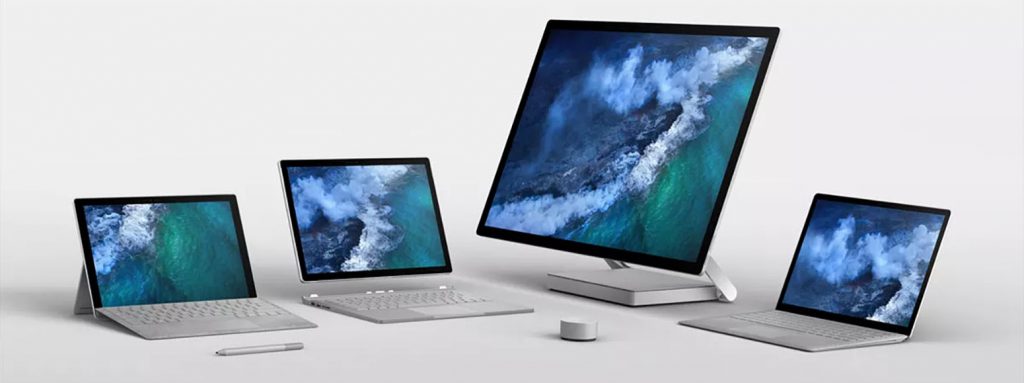
It is a “language” because it is a consistent rule set to help different product relate to each other, much like a how language helps people relate to each other. A simple example is the double grills on all of the BMW models since the 60s; if you see that on a car, you don’t need to see the badge to know it is a BMW.

Visual language makes the customer experience more consistent. Consistency of design can create a competitive moat because competitor products with similar visual language will be considered “copies” and only serve to validate the original.
How does a brand keep their visual language consistent when many designers will work on a brand? Executive designers can create guides and reference designs that will inform other designers decisions.
Editors note: This article was originally published on October 31, 2017 but has been revamped with new examples.
How does visual language affect business?
Making products look consistent over a product line might seem like a purely aesthetic pursuit. Showrooms, brochures and websites just look better.
But does a commitment to visual language result in more sales and higher profits? The answer is yes, for a number of reasons.
Visual language makes your brand recognizable.
You only leverage or grow your brand equity when customers recognize your product as a coming from your company. Your brand name and logo are meant to do this, but they only go so far. People use many products in which they do not know what brand it comes from because they never read the label or forget the name of the brand.
People are far more likely to recognize a product if it has a familiar design language. A customer remembering a positive experience could lead to a sale. At scale, that is a significant effect.
To create a consistent experience.
People struggle with the product from a business with no design language. Switching between such products is jarring for the customer; customers build expectations about how a product from a company should look and function, and it hampers the experience and takes away credibility when other products are different than the customer expected.
Customers will choose a product line that is consistent over one that is not, given a choice.
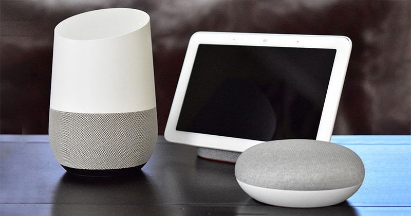
We actually criticized Google for not making the design language of their Made by Google line of products when it launched. That lack of consistent design language could impede customer experience and future sales.
To build a moat.
A company with a strong design language can have a long competitive advantage because they can “own” the design especially if it sufficiently different from the visual language of products in the same category. Any similar looking designs will be perceived as copies and not have credibility with potential customers.
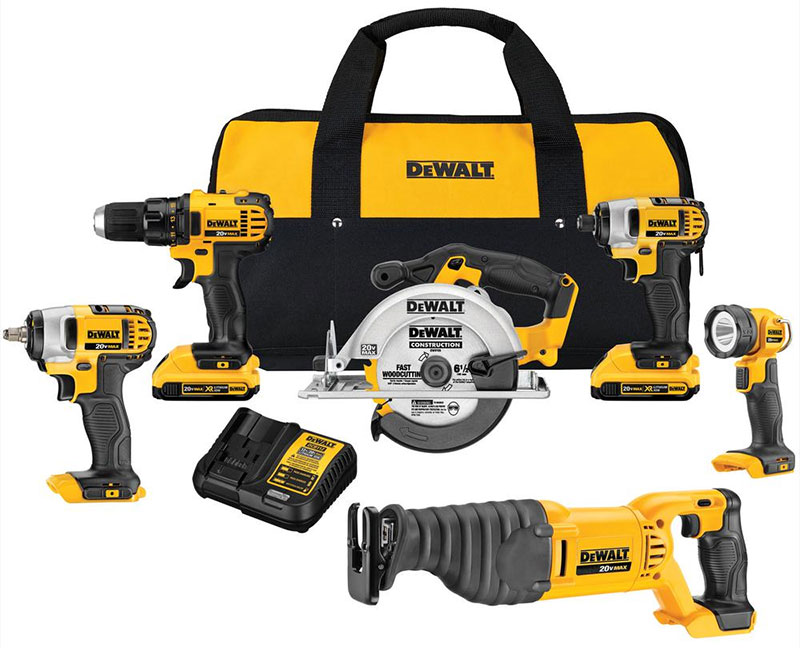
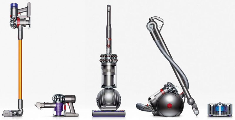
Strong examples of Visual Language:

How do you implement visual language?
A visual language if defined using by using reference designs and guides.
To implement a consistent visual language across your products, you need to explain the colors, styles, and details to the designers of your product.
“Currently our design department consists of nearly a dozen functions and outcome teams,” says Karri Saarinen from Air BNB design department. “It became clear that we needed more systematic ways to guide and leverage our collective efforts.”
Your brand standards guide should have some explanation for graphic designers. The brand standards might be enough for web designers and application developers, but often they look for style guides (like this one from Google), so the icons, menus and other interactive elements are consistent.
The design language of hardware products can be more challenging to explain through a 2D guide because it is 3D. This necessitates a reference design. Industrial designers, mechanical engineers, and architects love reference designs because it is a tangible, 3D example of what they need to strive to implement. The most well-known example of reference designs are concept cars (Wikipedia).
Mazda is best in class in using concept vehicles as reference designs to create a consistent visual language their production cars. The modern Mazda visual language was introduced in the Shinari concept car at the 2010 Los Angeles Auto Show. They implemented the visual language to the Mazda 3, their top seller, and the rest of their line.

Conclusion on Visual Language
Visual language is something the management of a business should understand and drive toward. Visual language, design language and visual vocabulary is not just a buzzword your head of design uses to sound important; they refer to an essential concept in brand marketing. Visual language is the most effective way to leverage your brand equity, and getting the most out of your assets is what proper business management is all about.
Leave a Reply