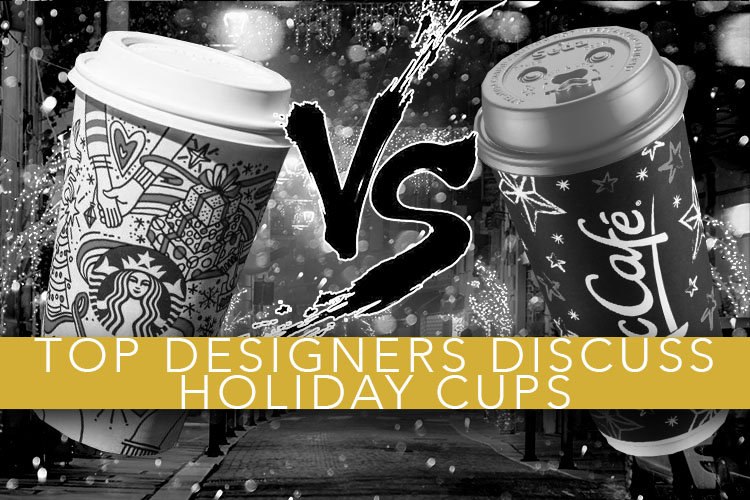
Alex Center, Jacob Cass, Chuck Anderson and Daniel Brokstad and Kelli Anderson comment on the holiday cups of 2017.
Executive Summary | Abstract | TL;DR
They didn’t invent the concept of holiday coffee cups, but Starbucks has increased the expectations of the designs with their twenty years of great holiday cups. Colin Finkle has assembled a panel of the top design minds in North America: Alex Center (Design Director for Coca-Cola), Jacob Cass (of JUST Creative), Chuck Anderson (of NoPattern), Daniel Brokstad (of Sagmeister & Walsh), and the innovative Kelli Anderson. The Starbucks cup this year is a favorite but falls short of previous years’ designs. The Canadians have the best showing, as McCafe Canada and Second Cup receive high praise.
Our design panel.
![]()
Colin Finkle (Host)
Studio Manager.
Matrix Marketing.
Website | Twitter | Instagram | Linked In
I have been creating designs to help clients compete in retail for a decade. I am the founder of Brand Marketing Blog. I am excited to bring all of these world-class designers together on this fun, holiday topic. The introductions and descriptions are my words, but I’ll let the designers give their opinions and then I will determine the consensus opinion in “the verdict” section.
![]()
Alex Center
Design Director.
Coca-Cola Company.
Website | Twitter | Instagram | Linked In
Alex is a designer out of Brooklyn, NY known for his work making vitaminwater what it is today. He is the man behind the design strategy for brands at Coca-Cola, which include vitaminwater, smartwater & Powerade. “You must think you’re pretty special,” 50 Cent once said to him; a comment which made him sweat on the spot.
![]()
Jacob Cass
Identity / Graphic / Web Designer.
JUST Creative.
Website | Twitter | Instagram | Linked In | Facebook
Jacob Cass works with clients such as Disney, Nintendo, Jerry Seinfeld and hundreds more with the design studio he founded: Just Creative. He went to school in Australia, but is a digital nomad; he has traveled to more than 85 countries with his laptop in tow, always working on a design.
![]()
Chuck Anderson
Owner.
NoPattern.
Website | Twitter | Instagram | Linked In
Mr. Anderson is an artist, graphic designer, photographer, and creative director based in Chicago. Chuck started designing professionally right out of high school and racked up great project after great project for his studio: NoPattern. He has worked with brands such as ESPN, Vans, Microsoft, Target, the Chicago Bulls, and Nike and media organizations such as GQ, Nylon, Wall St. Journal, TIME, and Complex.
![]()
Daniel Brokstad
Graphic Designer.
Sagmeister & Walsh.
Website | Twitter | Instagram | Linked In
Norwegian by birth, Australian by schooling and New Yorker through work, Daniel has a prominent position at the prestigious firm Sagmeister and Walsh known for their original takes and creativity. Daniel is a big part of that by specializing in branding, packaging design, typography and illustration.
![]()
Kelli Anderson
Artist / Designer / Tinkerer
Kelli Anderson Studio.
Website | Twitter | Instagram | Dribble
Kelli Anderson does not fit in a box, in fact, she would probably take that box and use the paper to make something really cool. She draws, photographs, cuts, prints, codes, and just generally creates interesting projects for herself and her clients.
 Starbucks
The annual water cooler topic.
No cup in the world gets more press and undue controversy than the Starbucks holiday coffee cup. It is fair to say that the artistry and joy Starbucks has brought to the holiday promotional cup over the last twenty years has raised the bar for all the others coffee chains on the list.
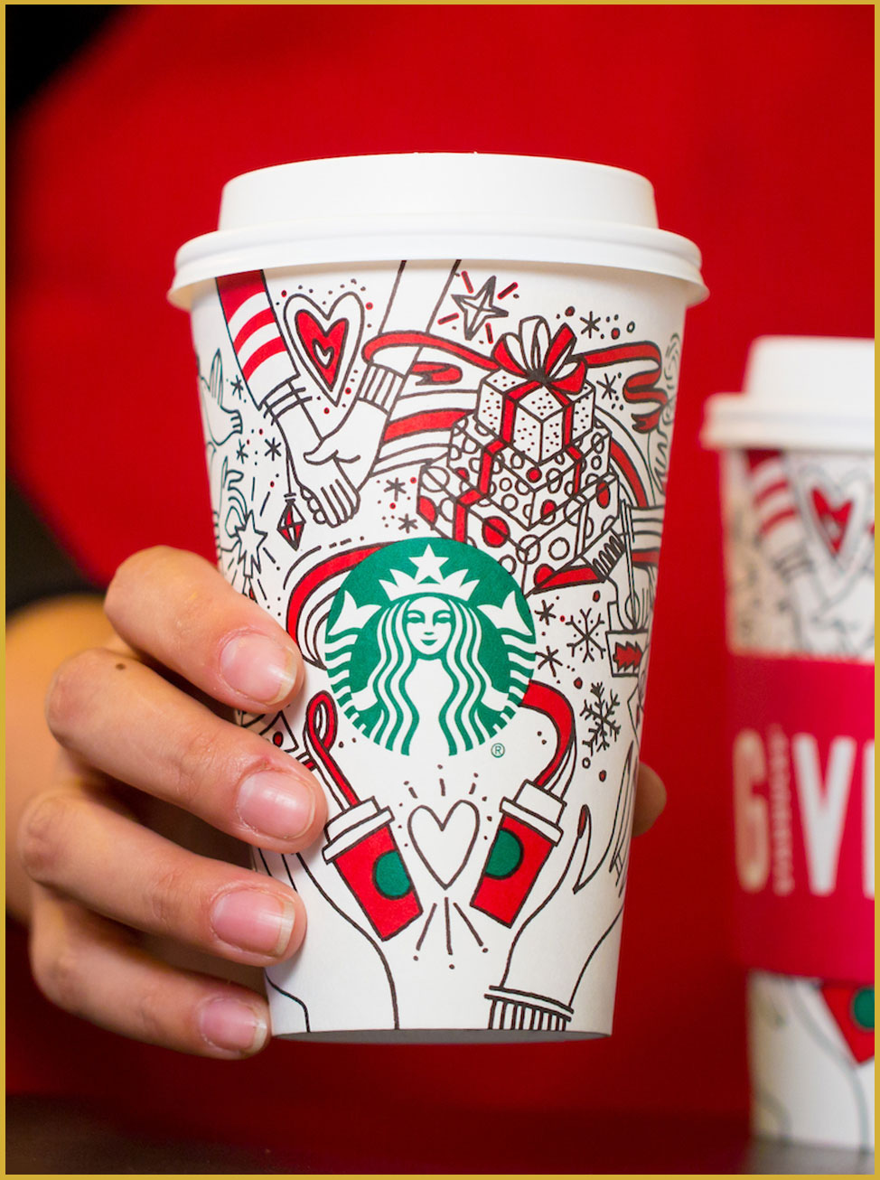
Starbucks holiday cup for 2017.
Photo courtesy of Starbucks. ©2017 Starbucks Corporation.
In this year’s design, Starbucks played to the emotions of gifting. It features art that looks like it was drawn using felt tip markets. The illustrator has drawn hearts, hands, snowflakes, gifts, and more; all symbols of the joy of gift giving. The cup is printed using three colors: black, a bright red and Starbucks brand green. The sleeves of past years have ruined the design, but this year the sleeve has “Give Good” and features the red of the cup.
What do you think of the design?
 Alex Center
Starbucks, the undisputed king of the holiday cup design game. I want to love this year’s rendition, but it just doesn’t live up to my unfairly high expectations. There’s nothing wrong with the hand drawn illustration style, but there’s nothing that makes me particularly excited either. Yawn.
 Jacob Cass
The silly season certainly is busy, and the Starbucks’ cup does a good job of conveying these themes in a chaotic but contained design, all centered around their logo. The unique doodles and pops of red color ensure that this design will stand out on the street.
 Chuck Anderson
This is my favorite because of all the cups it actually looks fun and joyful, not generic and stock. Starbucks consistently has well-designed products and drinkware, often utilizing well-known artists and illustrators to collaborate. I’m not sure who did this, and it’s not the most amazing illustration of all-time, but contextually it works really well, the logo is incorporated nicely, and it looks like someone had fun and put some thought into the drawing. Certainly the most memorable of the bunch
 Daniel Brokstad
My favorite of the cups. Although it might look a bit messy from a distance, holding it in your hand, I think it gives a certain level of entertainment to explore the illustration. The hand-drawn style makes it feel more personal and links to how names and drawings are often made on these cups as they are handed out.
 Kelli Anderson
Whenever I feel like I’ve become immune to being taken by the twinkle and wonder of the holidays, Starbucks manages to catch me off guard—I’ll pass a store display and those feelings from my childhood sneak right back in. It makes me want to hold-hands and ice skate. It makes me excited to elaborately-wrap a tower of presents for my loved ones… and to attempt to sip all of the marshmallows out of my hot chocolate. It feels so authentic and brings me there so quickly, that this one may be my favorite.
However, this design feels extremely urban and upscale (and aggressively-white-person!), so my only critique is that it may imply too narrow of an audience. This is always the peril with referencing real, vivid, specific memories—they are authentic but not universal.
The Verdict
Starbucks has set an unreasonably high bar for themselves set by the superb design of previous years. Unfortunately, this cup doesn’t live up to that standard. That being said, it better than almost all of the industry, and a favorite of some of Chuck Anderson and many other people I imagine.
 McCafe (US)
McDonald’s has invested much in their coffee, but what about their coffee cups?
We have all watched as McDonald’s coffee went from something best known for being sued over to something desirable enough to be a reasonable alternative for the Starbucks coffee crowd. This is due to smart investment in facilities and marketing, especially sampling. But did they invest enough in their holiday cup design to make it a contender?
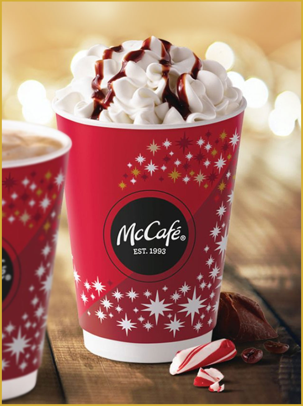
McCafe (US) holiday cup for 2017.
Photo courtesy of McDonald’s . ©2017 McDonald’s Corporation. All rights reserved.
In the McCafe holiday cup design for 2017, the designer has used the overlap between McDonald’s colors and Christmas colours; the cup features a red, white, black and cold color scheme. The only decorative element is a twelve point star sprinkled around three quarters of the McCafe logo. All the stars are white except for stars to the top right of the logo where they use some of the other colors. This, combined with subtle changes in size, create a depth affect to the star trail, making the stars look like they are coming out of the cup in a spiral.
What do you think of the design?
 Alex Center
For almost 20 years, i’ve been confused by the idea of McCafe. I simply just don’t understand why McDonalds is trying to brand their coffee as a separate “cafe” from their restaurants. There are zero McCafes in the US. Please just own the fact that you are McDonalds coffee. Then find a designer who can make you a compelling Christmas cup.
 Jacob Cass
The magic of festive season clearly comes through on this cup, and the red, white and gold stars drives this idea home. The candy cane is also a nice touch in the photography.
 Chuck Anderson
I can’t think of anything to say besides “This is fine.” I just looked at it, and I already forgot what it looked like.
 Daniel Brokstad
Probably my least favourite of the cups. It come across as too generic. The darker red shade doesn’t add much to this either. Maybe would be more fun if the stars was somehow illustrator something related to McDonalds, either their food or characters. Or simply just creating a pattern.
 Kelli Anderson
These stars feel far more 1960s Las Vegas strip than classic/timeless holiday twinkle. But I deeply appreciate the food styling of the whipped cream in this product photography. 🙂
The Verdict
While McDonald’s is investing in their coffee offerings, they don’t offer a cup that is anything other than generic. Nobody will hate it, but nobody will love it.
 McCafe (Canada)
Did their neighbors to the north outshine the US McDonald’s cup?
Winter is coming. The people of the north need to prepare. As a Canadian, I can say that the only way to survive the doldrums of winter is to lean in and just enjoy it for what it is worth, and the holiday season is a big part of that. This design impressed me, so I thought it was worth including.
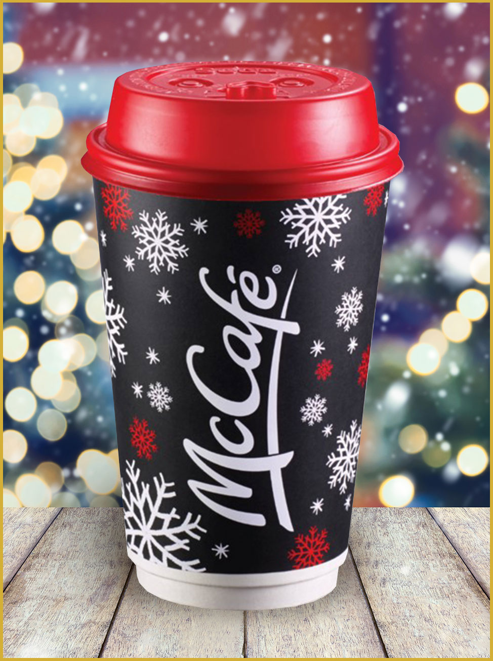
McCafe (Can.) holiday cup for 2017.
Photo courtesy of McDonald’s Canada. ©2017 McDonald’s Corporation. All rights reserved.
This cup all starts with a base of a chalkboard grey. On that base is are the McCafe logo and some snowflakes knockout white with some bright red. They have brought that bright red color into a custom cap. The cap is what makes this a truly great branding exercise; this cup is recognizable in the hands of people out and about.
What do you think of the design?
 Alex Center
McCafe is back! Putting my lack of understanding of McCafe aside, I definitely prefer this design to the other. I like the premium feeling color scheme and really enjoy the red top. I’d love to make the logo 40 percent smaller.
 Jacob Cass
Although these colors remind me of a Coca-Cola can, I do appreciate the simplistic approach of the snowflakes concept, even if it is not entirely unique. My scrutinizing eyes also picked up that all the snowflakes are the same.
 Chuck Anderson
This is my second favorite. The color palette is crisp, and that red lid, black middle and white bottom just looks really clean. Everything is thoughtfully placed, and the black is a ballsy choice for the holidays. I like it. Does what its supposed to.
 Daniel Brokstad
While a bit generic, I like the strong contrast of the red cup to the black cup. I wish they would have made some more interesting touches on the illustration elements themselves though. The logo could definitely have been smaller as well.
 Kelli Anderson
McCafe isn’t reinventing the wheel by using a pattern of dancing snowflakes at varying scales. But: It is lively and classic and fun. The red cup top makes an otherwise generic package feel very special and exciting. This one may be my favorite.
The Verdict
McDonald’s Canada has a strong concept here, but the graphic designers picked out some details with the design that would warrant some revisions. But that is a good thing; they wouldn’t be looking at the details if the concept wasn’t strong.
 Dutch Bros.
Awesome company culture = Awesome holiday cup?
Dutch Bros is a coffee shop unlike all the others on this list; it is known for it’s fun, hip and dynamic staff who man a drive-thru only shop. Employees love working there, and customers come for the employees and the drinks they lovingly craft. Did they use the same craft on their holiday cup?
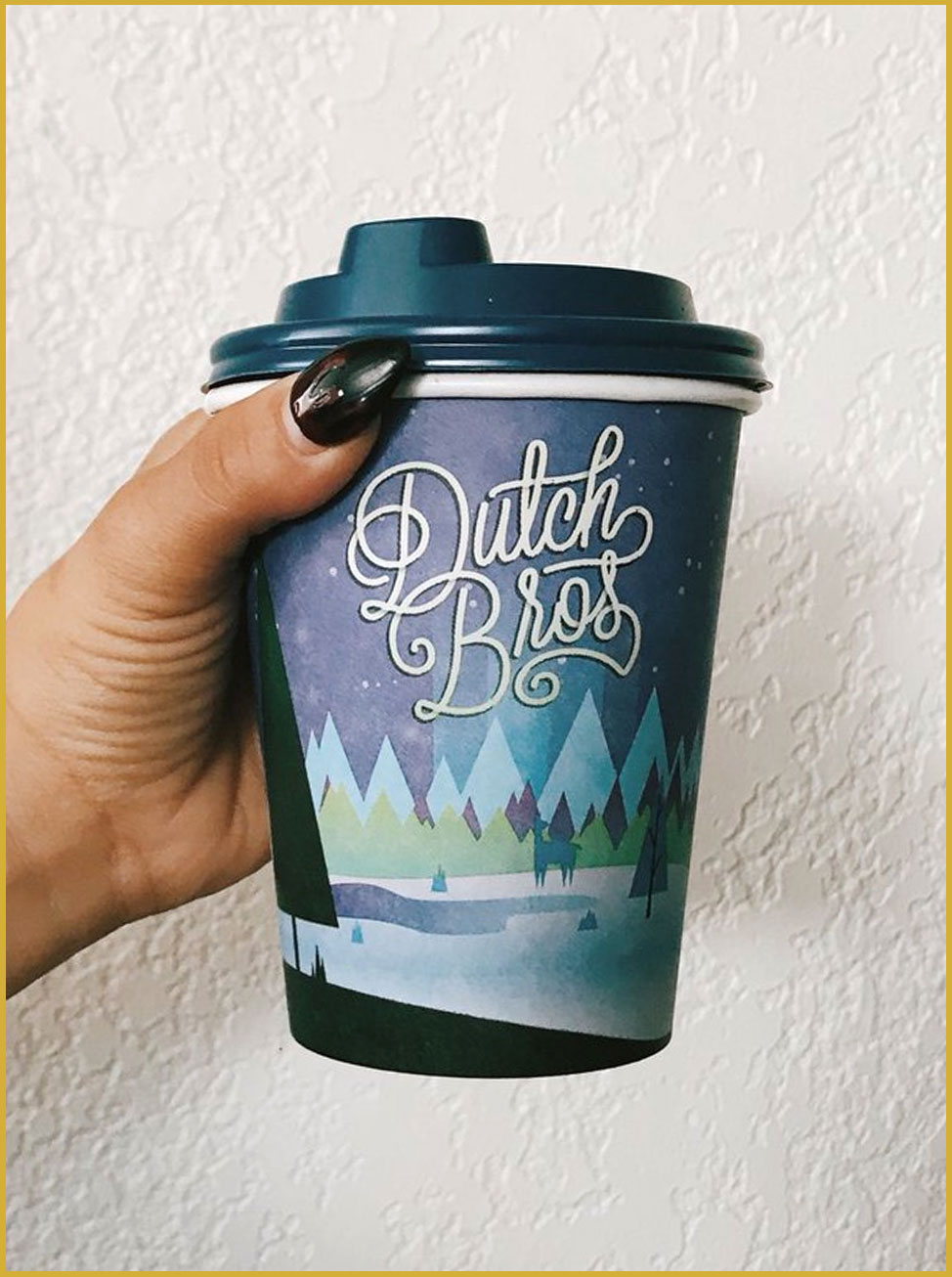
Dutch Bros holiday cup for 2017.
Photo courtesy of @luciavfranco. Thanks, Lucy!
This is the first cup on the list to ditch the classic red color scheme, and embrace a cool color scheme with blues and cool greens. The cup features a vector illustration of a winter scene at night in the mountains. The foreground of the illustration has a silhouette in dark teal and they have brought that teal into a custom cap to unify the design. A big statement is Dutch Bros ditching their company font from their logo, and having “Dutch Bros” in a custom word mark more fitting to the scene.
What do you think of the design?
 Alex Center
I’m not familiar with the Dutch Bros. but this design looks like it was made by a designer who either A) spends a little too much time on Etsy or B) downloaded a hipster graphic design parcel from Creative Market. Either way, it’s not for me.
 Jacob Cass
Dutch Brothers seem to be jumping on the trend bandwagon with their stylized logo, but it’s been executed perfectly. The logo works well with the illustration, and the cooler colors are a brave departure from the typical red themed coffee cups.
 Chuck Anderson
I like that they went with an unexpected color palette for Christmas. I can appreciate the use of blues, purples and pale greens and a total absence of red/kelly green as you’d expect. The illustration isn’t particularly unique but given the context it works pretty well. Logo is busy but somehow works pretty well with the whole thing.
 Daniel Brokstad
Very much a winter night mood and reminiscent of the long dark nights of the season. It seems the logo it clashing a bit with the illustration style itself, would have been nice if the logo was somehow part of the illustration more. Maybe if it was appearing as northern lights or stars in the skies.
 Kelli Anderson
This one sees the holidays through the lens of cultural references: I spy Charlie Brown’s triangular “commercial tree lot” trees—set amid the Island of Misfit toys. The lettering is reminiscent of late 2000s do-what-you-love culture’s hand-drawn scripts. This is a coffee cup designed to tap into for 30-40 year olds’ nostalgia, specifically.
The Verdict
The designers were a little tough on this one; most felt that the risktaking on the color scheme was a step in the right direction, but it came with an illustration that looked stock and generic. Maybe Dutch Bros. can commission an artist as Starbucks clearly has done.
 Dunkin’ Donuts
Classic cup for a classic brand.
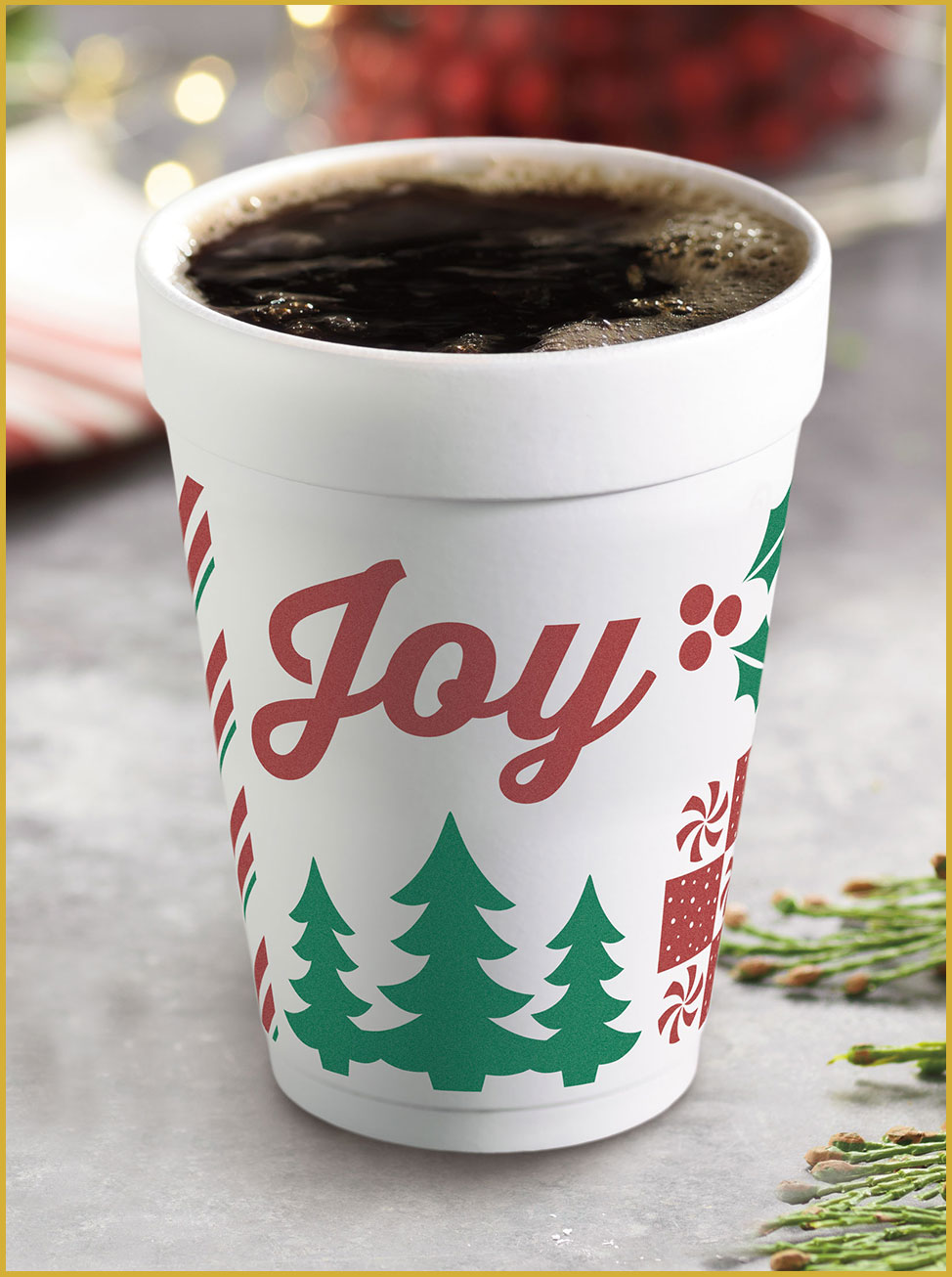
Starbucks has created a coffee revolution, but many if not most people still get their coffee from a humble coffee and donut shop, and Dunkin’ Donuts is what people think of when they think of those shops. So what do they offer for the holidays? Classic coffee in a classic styrofoam cup.
Dunkin Donuts holiday cup for 2017.
Photo courtesy of Dunkin’ Donuts. ©2017 DD IP Holder LLC.
This is the only cup on this list that is styrofoam; it seems fitting. It is printed with two colours: a muted red and a lightened green. There are a few vector shapes that are decidedly Christmas themed. No PC culture here. If there is a statement here, it is in the word “Joy” featured prominently on the cup. That’s about it.
What do you think of the design?
 Alex Center
I’m not sure what brand is responsible for this cup design, but I kinda like it. It’s a simple in a classic utilitarian type of way. It’s not trying to be cute, just bring you joy. With that said, I don’t think this coffee is going to taste good. Maybe its the typeface.
 Jacob Cass
Dunkin’ is clearly bringing back the basics in this sparse, slightly anemic design. The text focused design stands out, but not in a good way. It lacks Dunkin’s branding and reminds me of pre-made design you might find in your supermarket.
 Chuck Anderson
I just feel absolutely nothing looking at this. It says joy but is so, so sad. Generic and forgettable. I know Dunkin’ Donuts branding is super basic and that works for them, but I’m certain they could have done something better than this church pamphlet looking ass graphic.
 Daniel Brokstad
Quite simple design, which doesn’t have to be a bad thing. However I wish it would be more decorative at first glance / front. For example by having more of the pattern and elements go around the big “joy”. Good at legibility from a distance.
 Kelli Anderson
The choice to bring more non-biodegradable, petroleum-based, benzene-containing styrofoam materials into this world is so cynical, it makes this “joy” clip-art feel very dark and alienating.
The Verdict
I didn’t think this one would get high praise, and I was right. It sort of stuck Alex in a way that worked, but everyone else felt the design put the coffee and the brand in a bad light. Plus, styrofoam? Think about the planet next year!
 Costa Coffee
Does a warm and homey look bring home the bacon?
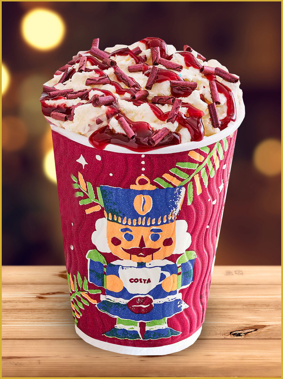
Costa Coffee was new to me, but is actually the second largest coffee chain in the world (Starbucks is the largest.) They are the number one coffee shop in the UK and are suitably headquartered in Bedfordshire. The warm and cozy look has been brought into their holiday cups. There is a whole line of them, but we will only be looking at the nutcracker cup as a representative.
Costa Coffee holiday cup for 2017.
Photo courtesy of Costa. © 2013 – 2017 Costa. All rights reserved.
The Costa Coffee holiday cup looks like it is a piece of art drawn with markers. It looks childish and sophisticated at the same time, which you could say about the holiday season in general. They have brought their signature dark red in as a base, and have green, blue and beige inks in to make the designs. The cup only features a small “Costa” logo on the mug the nutcracker is holding, but the the brand red makes the whole cup recognizable as coming from Costa Coffee.
What do you think of the design?
 Alex Center
Ah, the nutcracker. A classic Christmas icon that doubles as a functional kitchen utility item. I like how unbranded this cup, but the design feels too antique for my personal taste. Related, nutcrackers kinda scare me.
 Jacob Cass
What really stands out to me here is the unique wavy texture of the cup, which I imagine would bring home the experience of this velvety, delicious treat. The screen-printed effect of the soldier illustration, backed by Costa’s warm maroon red makes this feel very festive! This is my favorite from the bunch.
 Chuck Anderson
I don’t see this as design or even particularly thoughtful. Looks like something you’d find at a gas station. Just boring, generic Christmas stock art that is neither ownable for Costa or memorable for a customer. They’re getting a big chunk of coal in their stocking for this one.
 Daniel Brokstad
Cute illustration that reminds me of stop-motion animations usually shown around Christmas. Compared to many of the other cups, I like that this design is able to live on it’s own without being consumed by a logo. Also easy to spot the character from a distance. The red could have been a little bit more pop.
 Kelli Anderson
The colors are a bit off and the shapes a bit decomposed (and misregistered.) This one touches-on that appealing feel of being made with antiquated print technology. However, it makes me nostalgic for the wrong thing: more for the roughly-silkscreened t-shirts I bought in Egypt a few years ago—not for home for the holidays. I appreciate the design for not-working-as-intended in an interesting way.
The Verdict
Putting Alex’s nutcracker phobia aside, this one split the judges in a ‘love it or hate it’ sort of way, and that is actually a good thing. Customers who like this cup will love it. Everyone appreciated the reference to old print technology and the restraint on the logo size.
 Second Cup
We could have a contender here.
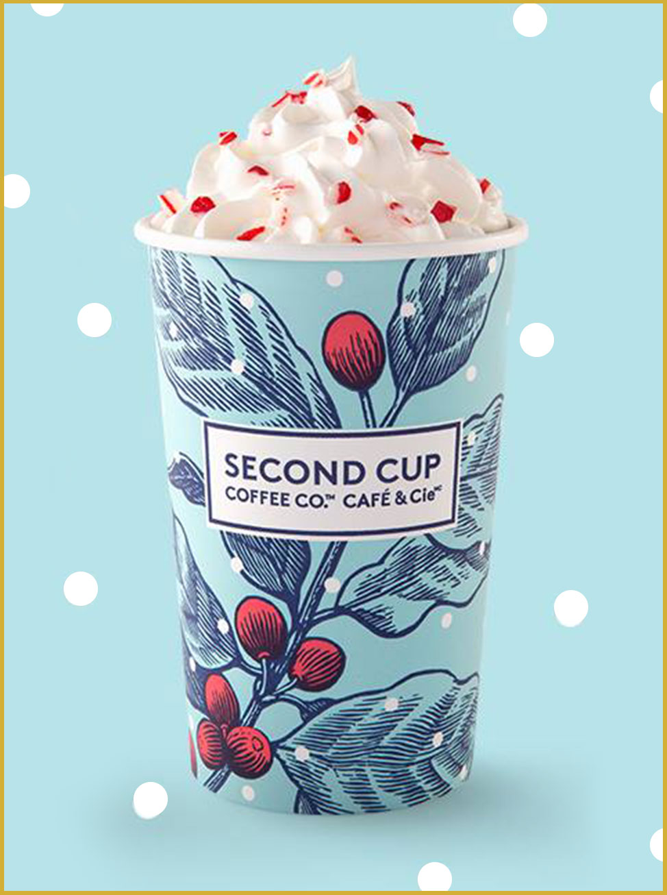
Full disclosure: Second Cup is my coffee shop of choice. Before Starbucks took over Canada, Second Cup was on every corner of Toronto. Now they have been knocked down and have recently rebranded as part of a turnaround effort. Their drinks are great, their new branding is great, and the atmosphere of the renovated stores is great, but is their holiday cup for 2017 great as well?
Second Cup holiday cup for 2017.
Photo courtesy of Second Cup. © 2015 The Second Cup Ltd. All rights reserved.
The Second Cup holiday cup bucks the trend and starts with a cool, light blue color scheme. There is an pen and ink illustration of a mistletoe stalk using dark blue lines and red berries. The entirety makes for a great color scheme. The logo is featured prominently in the center. Whit circles are knocked out to represent snow flakes.
What do you think of the design?
 Alex Center
I’ve never heard of SECOND CUP COFFEE CO CAFE AND CIE but that name is quite a mouthful. With that said, I actually really like this design. I’m feeling the tasteful floral wallpaper vibe and the overall color scheme. (Blue!) Props to SCCCO&C for breaking away from the pack and proving that you don’t have to use green and red to feel holiday.
 Jacob Cass
I appreciate the unique approach of focusing on just one element of the season, with the red berries balancing the icy cool of the cup. Their branding stays true, while bringing some festiveness to their cups.
 Chuck Anderson
I’m judging this in the context of being Christmas-themed and I’m not sure how this is Christmas related. I thought maybe they meant that to be holly, but holly leaves are sharp and pointy, and now I realize maybe it’s just coffee cherries from a coffee plant. The design is nice enough, simple and the light blue is welcoming, I just don’t see this as Christmas I guess?
 Daniel Brokstad
I like the illustration style and how it lets the mistletoe be the entire element of the cup. Makes it appear quite sleek compared to some of the other cups. But it’s maybe also the cup that at first glance has the least Christmas mood to it.
 Kelli Anderson
I’m surprised that this is considered a holiday cup design. It reminds me of a springtime motif on a child’s dress.
The Verdict
I think we have a contender for Starbucks! Second Cup recieved good reviews from the judges, at least from the judges who saw the mistletoe stalk as a holiday symbol. And they did it their own way without taking style from Starbucks previous designs. Hats off Second Cup! (Otherwise known as SCCCO&C if you are Alex!)
Leave a Reply