
A professional designer talks about what the font in a logo says about the brand.
Fonts are magic. They can play with our emotions and affect how we feel about the words that they represent.
Have you ever had someone send you an email in all caps? It feels like they are yelling. The content hasn’t changed, but the presentation affects how we feel about the message.
The font choice of an organization’s logo says a lot about them. The same brand name in different fonts can come across feeling authoritative or whimsical, sophisticated or down to earth.
Sales via Aligning with the Buyers Feelings
Billion dollar brands have designers and marketers considering the choice of front for their logo for hundreds of hours. The designer considers hundreds of fonts, and the executives chose from more than twenty options.
Why so executive care so much about font choice? Alignment between the feeling of the brand and the product can result in more sales. People want to feel a certain way when they purchase a probduct. We want to feel confident when buying a car, and happy when buying a chocolate bar. The font logo can affect the buyers feeling about the purchase.
Consider if Cadbury and Boeing switched fonts. Boeing now has to negotiate billion dollar purchase orders of planes with a whimsical, handwritten logo. And Cadbury had to sell chocolate bars with an authoritative, all caps logo. How do you think that would affect sales?
The font swap would make sales go down for Cadbury and Boeing. The governments and airlines buying Boeing’s planes would wonder if Boeing is taking aviation seriously. And Cadbury fans would be left wondering: “Why so serious? I want a fun candy bar.”
Differentiating with Fonts
Type is also a great opportunity to signal that your brand is different than your competition. We wrote about how 17 brands define their fonts for consistency and differentiation.
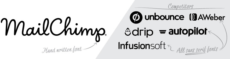
MailChimp is a tech company, and you would expect them to use a modern font like their competition. But they use a handwritten font to differentiate themselves as more friendly to users.
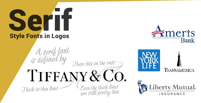
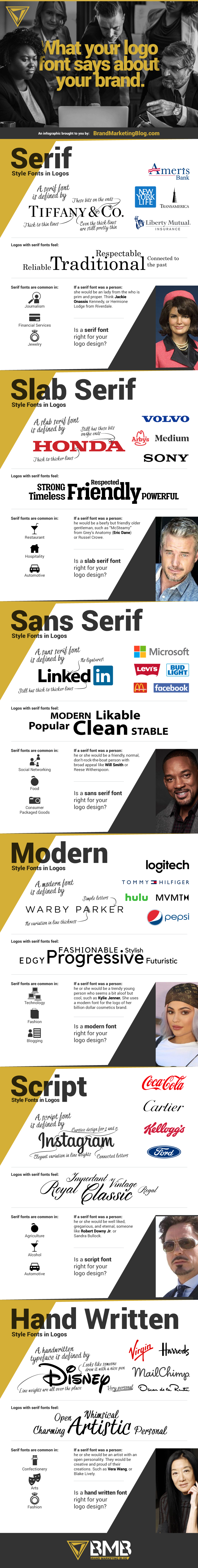
Serif Fonts in Logos
The letters in serif fonts have small hooks on the end of lines called ligatures. These were designed to aid reading by letting one letter flow into the other.
Now they seemed old fashioned. There has been a flight away from serif fonts; companies like Google have spent tens of millions of dollars to replace the serif font in their logo. It is hard to find current examples because so many companies have rebranded. They are trying to avoid the old-fashioned perception.
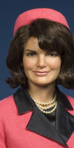
If a serif font was a person: she would be an lady from the who is prim and proper. Think Jackie Onassis Kenedy, or Hermoine Lodge from the Riverdale.
Logos with serif fonts feel:
Traditional
Respectable
Reliable
Connected to the past
Serif fonts are common in: journalism, financial services, and jewelry.
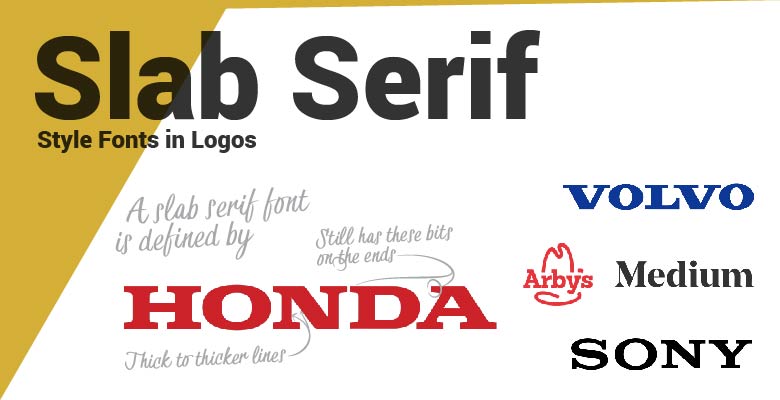
Slab Serif Fonts in Logos
While slab serif is just a bold version of serif, they are perceived very differently. Slab serif fonts keep the ligatures of serif but have bold, thick-to-thicker lines.
Logos with slab serif fonts are far more masculine. They can be friendly, but have a sturdy, authoritative feel too, especially when displayed in all caps. While everyone is running away from serif fonts, slab serif logos are still acceptable. Slab serif fonts read well in small applications like as badges or on social media profile pictures.

If a slab serif logo were a person: he would be a beefy but friendly older gentleman, such as “McSteamy” from Grey’s Anatomy (Eric Dane) or Russel Crowe.
Logos with slab serif fonts feel:
New
Friendly
Timeless
Strong
Slab serif logos are standard in: the restaurant, hospitality, and automotive industries.
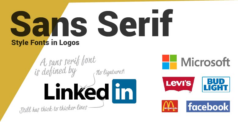
Sans Serif Fonts in logos
Sans-serif means “not serif.” These fonts loose the ligatures on the end of letters but keep the thin to thick linework.
Removing the ligatures was bold and progressive move, both characteristics brands like as descriptors. So it is no wonder why this is the most common choice for wordmarks now.

If sans serif fonts were a person: it would be a friendly, normal, don’t-rock-the-boat person with broad appeal like Will Smith or Reese Witherspoon.
Logos with sans serif fonts feel:
Stable
Clean
Modern
Powerful
Sans serif fonts are standard in: social networking and food industries.
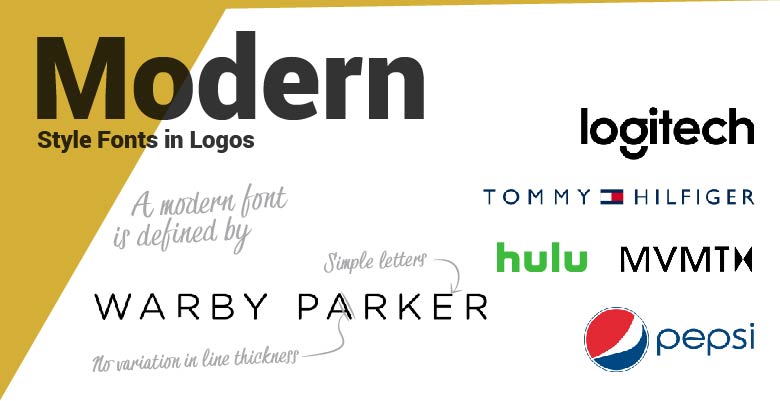
Modern Fonts in Logos
Modern fonts feature very simple, and minimal characters made with only consistently thick lines.
While these fonts would be challenging to read over paragraphs, they create simple, iconic logos. Companies that want a forward-thinking perception choose a modern font or make their own.

If a logo with a modern font were a person: he or she would be a trendy young person who seems a bit aloof but cool, such as Kylie Jenner. She uses a modern font for the logo of her billion dollar cosmetics brand.
Logos with modern fonts feel:
Strong
Progressive
Stylish
Masculine
Modern fonts are standard in: the tech, fashion, and blogging industries.
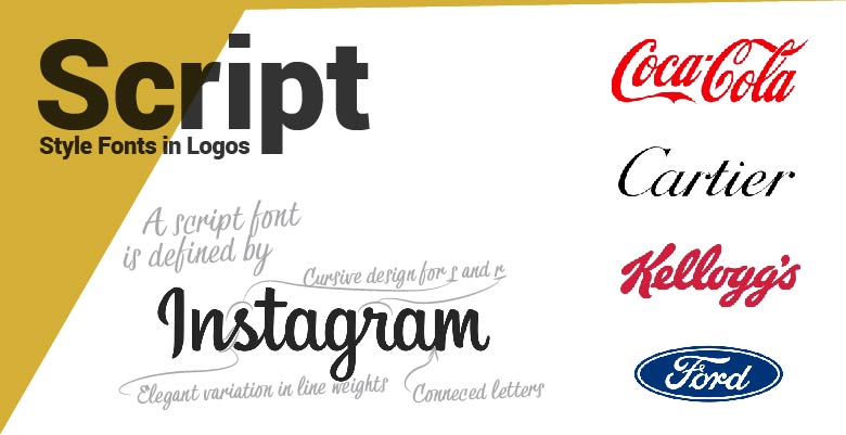
Script Fonts in Logos
Script fonts come from cursive writing. The lowercase “s” and the “r” have alternate designs. The linework is like calligraphy, elegantly varying from thin to thick.
Script fonts are considered old fashion but are resurging. They are perceived as classic, an all-time favorite. You see it on classic brands like Coca-Cola, but Instagram famously bucked trends and chose a script font.

If a script font logo were a person: he or she would be well liked, gregarious, and eternal, someone like Robert Downy Jr. or Sandra Bullock.
Logos with script fonts feel:
Classic
Vintage
Regal
Important
Script fonts are common in: the agriculture, alcohol, and automotive industries.
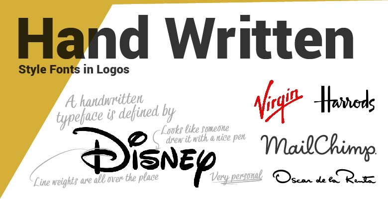
Hand Written Fonts in Logos
Handwritten type wordmarks look as if someone has taken out a quality pen and signed their name. The linework varies in thickness and is not as clean as a designed font.
Handwritten logos are the most personal because of the association with signatures. People think “if someone is willing to sign it, it must be good.” In fashion, it creates a link right back to the designer.

If a handwritten logo were a person: he or she would be an artist with an open personality. They would be creative and proud of their creations. Such as Vera Wang, or Blake Lively.
Handrwitten logos feel:
Whimsical
Friendly
Personal
Open
Handwritten logos are familiar in: the confectionery, arts, and fashion industries.
Character Styles: Italics, All-Caps, Lowercase, and Kerning
Note that the perception of all of these fonts can change by applying italics, all-caps, and adjusting the kerning.
Italics: The slant of the letters. Italic font logos have movement to them.
All Caps: Capitalizing all the letters. Capitalizing all the letters makes a logo seem authoritative.
Lowercase: Using no capital letters in a logo. Using only lowercase makes the logos more friendly and youthful.
Kerning: Adjusting the space between the letters. Logos with large spaces between the letters make it more modern and mysterious.
We will write more on these in the future. Just keep in mind that character styles are tools to use with all of the font types listed above. Between the font and the properties, a designer can dial in what the viewer feels about the logo.
Further Reading about Font Choices
If you are interested in expressing a brand’s personality with fonts, than we go deep into the font choices of some brands.
17 Examples of the Typography Pages in Brand Guidelines
We look how some brands are defining their fonts to make their brands stand out from their competition, while remaining consistent between designs.
A Love Letter to the Anthem Logo
One of my favorite new logo designs leans very heavily on typography design. It’s amazing what good typeface choices can do for a design.
Infographic
Leave a Reply