How to create an effective brand standards manual.
Executive Summary | Abstract | TL;DR
The purpose of a brand standards is to build consistency. They are forward-looking. Think about what the users of your brand standards are looking for. Users of brand standards include designers, copywriters, marketers, business development, staff, and vendors.
Plan out your brand manual using a Powerpoint Document. Solicit feedback on the draft before engaging a designer; this initial feedback from stakeholders will make getting final sign off from them easier down the road. PDF or Powerpoint documents are acceptable formats, but websites are becoming more common.
Required pages include the mission statement, personality, mood board, logos, logo do’s and dont’s, additional graphics, color pallet, fonts, photography guide, legal, contact and changelog. Other pages may be required depending on your business. Some pages like “Letter from the CEO” are common, but not necessary.

The purpose of the brand standards document is to align the outputs of employees and external vendors so the company can present a consistent, coherent look and voice.
Brand books are exciting and aspirational. They may not be exactly how you are right now, but how you want to be and present your company. Think of the company you would like to present yourselves as in the next six months to two years, and that company should be reflected in your brand standards. Be bold.
Getting started.
Take a user-centric approach to the brand standards manual. Think of the people that will be reading the guide and what they are looking to get out of it, and what excites them.
The traditional primary users of brand standards documents have been the graphic designers, but times are changing, and more professions in the organization are making content that will be viewed by customers and making business development deals that affect the brand.
It is advantageous for all employees to read the document because the company will appear more consistent and authentic if the brand standards are followed internally as well as externally, particularly the company mission and tone. We know from our definition of brand that our brand lives in the minds of our customers and potential customers, but it starts in the heart of the company employees and is carried out by them.
Let’s talk to some users of your brand manual:
 Designer.
“What logos, colors, and graphic elements can I use? It would be great if there is a personality or a tone I can strive towards.”
 Copywriter.
“I can convey information in many different styles. What style would you like for your company? I also need to know what terms I can and cannot use.”
 Marketer.
“I am going to be bringing this brand to the masses; I need to understand it thoroughly. It will affect where, when and how I showcase the company.”
 Business Development Professional.
“I don’t want to waste time on deals that aren’t a good fit for the brand. I need to know why this brand will result in more sales. I need to share this document.”
 Front Line Staff Member.
“What are we building with this company? Why am I here? How should I present myself? I hope I am working towards something bigger than just money.”
 External vendor.
“Help me help you! We need to get on the same mission so that our company can help yours.”
Keeping in mind those professions will be reading your brand standards manual, it needs to be:
- Explain not only the what, but the why
- Jargon-free
- Easy to navigate
- Start with information everyone should know
- Finish with more specific information.
- Be consumable in less than 15 minutes
- Very visual
- Include a change log at the end
Plan it out.
Decide what pages need to be in your brand book. We have a list of pages below, and I have gotten you started by suggesting what pages are essential, sometimes helpful and never useful.
After you have decided on a list of pages, quickly mock up each page very basically. Doing this on paper or in an unformatted Powerpoint presentation is all that is required. Straightforward and quick. It does not have to look good; that will come later. Just focus on the information you need to convey.
Get feedback on your mockup. Any change you make at this stage will be far easier, less time consuming and cheaper than when you are further in the process.
Decide what format you would like the final document should be. Powerpoint is a fine choice, as people of any skill level will be able to make edits in the future. PDF is preferable because the file size will be lower, it will look better, and you can make chapter links to set up a table of contents that people can click. The drawback to PDF is that it is only editable by a graphic designer, and thus is only a good choice for company’s that have a staff designer or a great relationship with a freelance designer.
![]()
Pages you need:
01. Mission
A one line mission statement. This states what your company is accomplishing, beyond making money.
02. Why this mission?
This explains why this mission is the right mission for your company and it’s employees, vendors and customers should get on board.
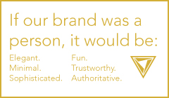
03. Personality
What personality descriptors would you want a customer to use when describing your brand? This helps designers, copywriters, and human resources.
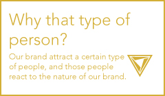
04. Why this personality?
Why is this personality strategically positioned to better complete the mission and make more sales?
Do you know of good examples of this slide? I couldn’t find one. Please comment.
05. Mood board
Images of objects and scenes that represent the personality of the brand.
Do you know of good examples of this slide? I couldn’t find one. Please comment.
06. Logos
All of the approved logos. Logos for on light backgrounds, and dark backgrounds. Note which are preferred logos for sponsorship or co-branding.
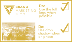
07. Logo Dos
Best practices around using the logo.
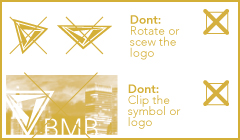
08. Logo Don’t
Examples of how the logo should not be used.

09. Addition icons / graphics.
This is the place for sub-brand logos, symbols and other graphic elements associated with the brand.
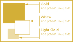
10. Primary color palette
These are the preferred colors shown in swatches and defines in values for RGB, CMYK, Hex, and Pantone. Note here if any of the colors is out of gamut for CMYK (ie. note printable with 4 color process), as graphic designers and printers will need to know.
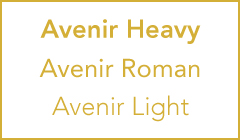
11. Typefaces
These are the names of the fonts to be used.
We have an entire article about typography spec pages in brand guidelines.
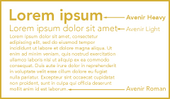
12. Headline / Sub-Head / Body copy
These are the fonts in use as a mock paragraph with a headline, sub-headline and body copy. This page should also define what colors the type should be in what instance, and if the letter spacing (kerning) is modified.
Do you know of good examples of this slide? I couldn’t find one. Please comment.

13. Existing photography
These are examples of photos that are already taken or purchased that can be used in designs.

14. Choosing new photography.
This should be a guide on how to take or choose new photos so that it is consistent with the old photos and the brand personality.
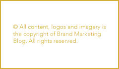
15. Legal and copyright.
This page includes the required legal lines to protect the company’s trademarks and copyrights. Make sure you can copy and paste it!
16. Contact
Who do you call if you have questions? This is a list of contact information to the people responsible for the brand.
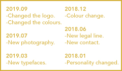
17. Change log
This page is a list of changes in the document and when they occurred so that a user of the brand book can know if anything they previously have done has changed and is out of date.
Pages you may need:
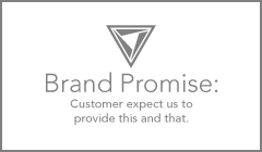
01. Brand promise.

02. Brand fantasy.
A lifestyle, a feeling, a place that the customer aspires to when purchasing and using the brands’ product. For example, the carefree surfer for the brand Quiksilver.
Do you know of good examples of this slide? I couldn’t find one. Please comment.
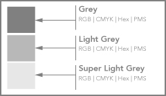
03. Secondary color palette
These are approved colors to be used when the colors of the primary color pallet are not appropriate to use. They should be defined in the same ways as the primary colors.
04. Industrial design guide.
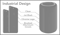
This is a list of preferred materials, forms, and ways the logo appears on the design of the product. This is challenging because it becomes out of date quickly.
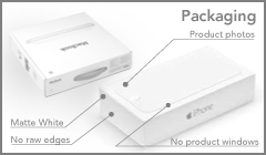
05. Packaging guide.
The guide should make product packaging look consistent across the entire brand’s product line.
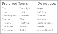
06. Preferred industry terms.
This is for copywriters to know which terms to use consistently for the brand’s industry.
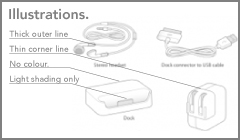
07. Illustration guide.
If the brand features illustrations, then there should be a guide aligning illustrators on the artistic style.
Do you know of good examples of this slide? I couldn’t find one. Email me at [email protected].

08. Mascot guide.
If your brand has a mascot (as we do with Fen), then you need a guide to what poses he / she / it are pre-illustrated and what is acceptable and not acceptable uses of the mascot.
Do you know of good examples of this slide? I couldn’t find one. Please comment.
Pages you don’t need:
01. Letter from the president / chairman / CEO
The brand book is not an opportunity to have people read a 1000 word essay on why the companies brand is so important. People are using this document for a specific purpose, and this page offers no information anyone is looking for and thus noone reads it. You could argue that this page increases adherence through an endorsement the practices in the book from upper management, but that endorsement should be assumed. Upper leadership should communicate the importance of the companies brand, but in venues like all hands meetings, retreats, and internal communique.
02. Logo spacing.
You see almost brand standards document include a page with a letter in the logo used to show that the logo should not be close to any other element, i.e., have room to breath. I would venture to guess that less than 1% of graphic designers have ever used this. Good graphic designers understand things need space, and a poor graphic designer is not going to go through the exercise of moving and rotating a letter out of the logo to see if they are too close. This page helps no one. And there are better ways in Adobe Photoshop and Adobe Illustrator to show minimum space requirements.
03. Co-branding guidelines.
In our experience, co-branding projects are rare, unique and supervised, and thus do not need to be in the document. Co-branding restrictions may be so limiting that they place an undue burden on the partner brands and kill the opportunity. Instead, we suggest mentioning which are the preferred logos for sponsorships/co-branding on the logo page.
04. Brand voice.
This part is typically a page to align copywriters on a writing style but is never effective. A copywriter who is good enough to follow such a style guide will already know how to write from the “Brand Personality” page. A poor copywriter is not sufficient to write copy AND follow a style guide, so it helps no one. The only thing a quality copywriter will need clarification on is preferred industry terms (e.g., should I refer to the products as a “smartphone,” “mobile phone” or just “phone”?)
Designing and Finalizing
You can give your mockup to a graphic designer, and they will be able to do format it. You shouldn’t need a copywriter as a brand book is most effective when there is not a lot of text.
You probably need some approvals or consensus around the finalized standards. These approvals can be challenging.
It is far easier if you do two things. One, keep the whole process collaborative. If people feel a part of the process, listened to, and valued, then they will sign off on the result. Second, be able to explain why you made all the choices in the book, from font choices to legal lines. You are going to be unconvincing if there is no reasoning, and decisions just came down to your personal preference.
Distribution
The brand standards document should be a living document meaning that it will change. Nothing is set in stone. We do not recommend printing out many of them and distributing them. We do recommend keeping it in a digital format stored in a place that is easily accessible to all employees. Some companies release their brand standards externally, but we do not
Some companies release their brand standards externally, but we do not recommend this.We have worked with brands who set up their brand standards as a password protected website in an easy
We have worked with brands who set up their brand standards as a password protected website in an easily editable content management system like WordPress, and this is a fine solution but unnecessarily complicated. A Powerpoint presentation or PDF will suffice for 99% of companies.
You’re done!
Congratulations, you now have a document that will align the company’s efforts and build a reliable brand. Now comes the hard work of keeping people aware of the brand standards, and using them.



Leave a Reply